

Nearly 1 in 5 people in the U.S. have a disability, yet many websites still fail to meet accessibility standards. An accessibility glossary can clarify these concepts, helping you understand key terms and design more inclusive products. As a designer, these simplified definitions support you in creating websites and apps for all.
Quick Summary
This article introduces essential accessibility concepts designers need to build inclusive digital products. It explains foundational principles, such as the Web Content Accessibility Guidelines (WCAG), along with key terms related to visual design, structure, interaction, and assistive technology. By understanding these basics, you can avoid common accessibility issues and create user experiences that work for everyone.
Accessible Design Basics in this Accessibility Glossary
Before diving into design elements, it’s essential to understand core accessibility concepts. These principles and guidelines form the foundation of an inclusive web. They provide a shared language and a standardized framework for creating inclusive experiences.
Accessibility (A11y)
Accessibility (a11y) is the practice of designing digital products so people with disabilities can perceive, understand, navigate, and interact with them. In the web context, it ensures content works for users with different abilities, devices, and assistive technologies.
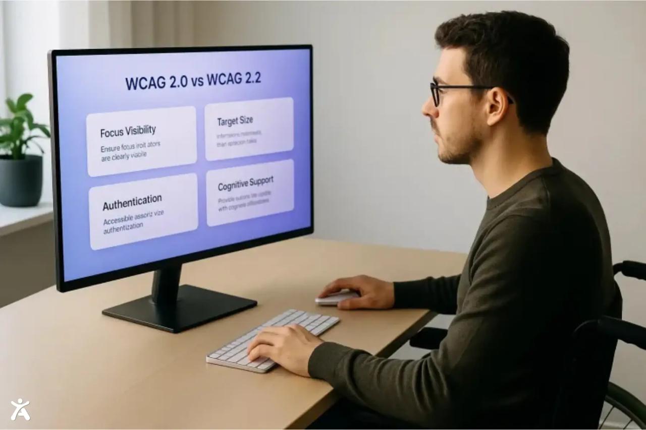
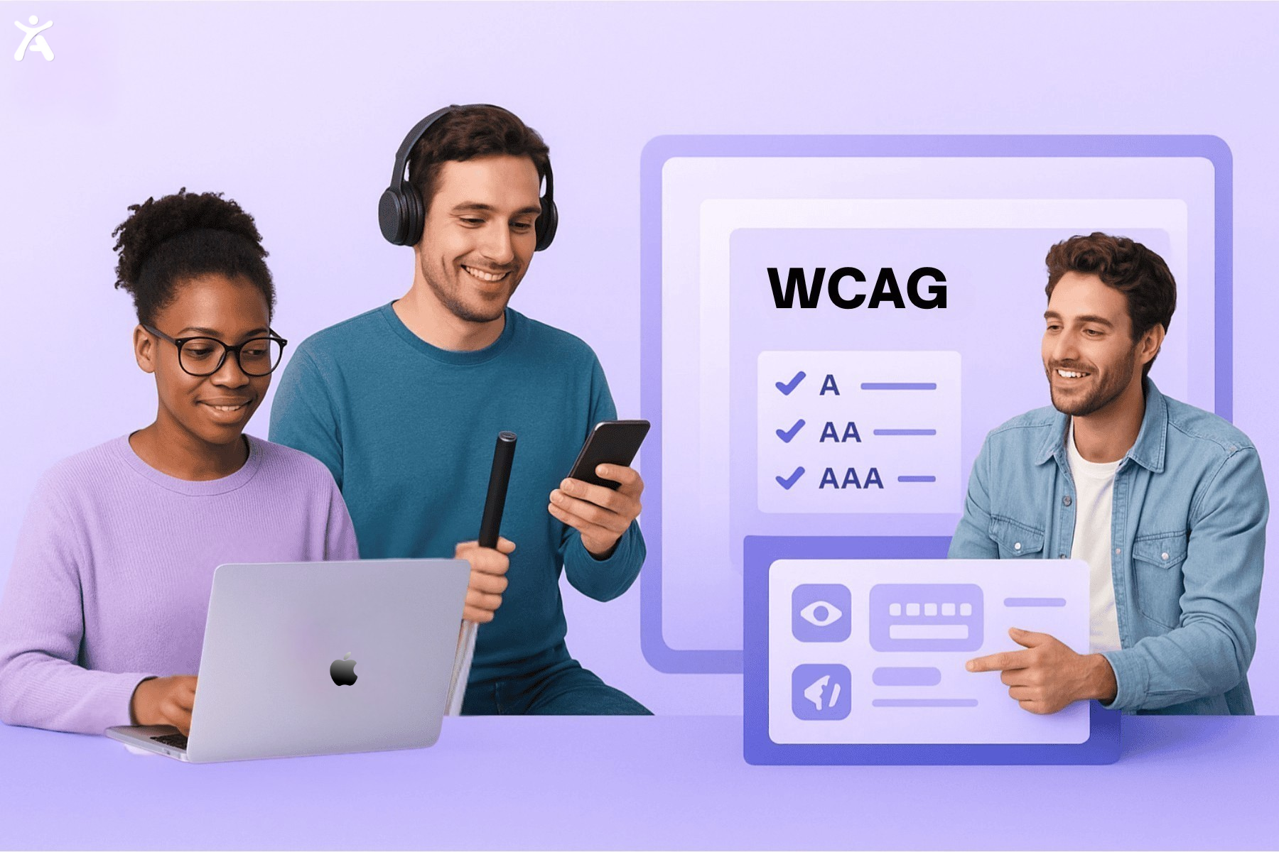
Web Content Accessibility Guidelines (WCAG)
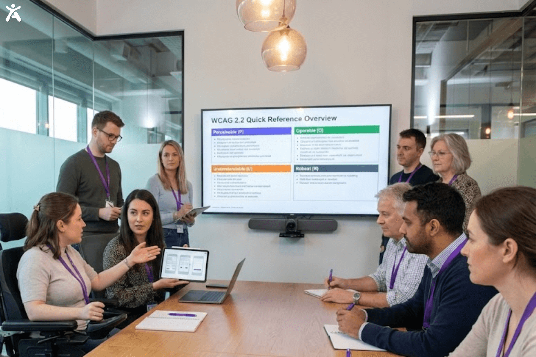
WCAG is the international accessibility standard developed by the World Wide Web Consortium (W3C). It explains how to create web content that is accessible to people with a wide range of disabilities, including visual, auditory, motor, and cognitive impairments. These guidelines also improve overall usability and consistency. WCAG is organized into four principles: Perceivable, Operable, Understandable, and Robust, which form the foundation of accessible digital design.
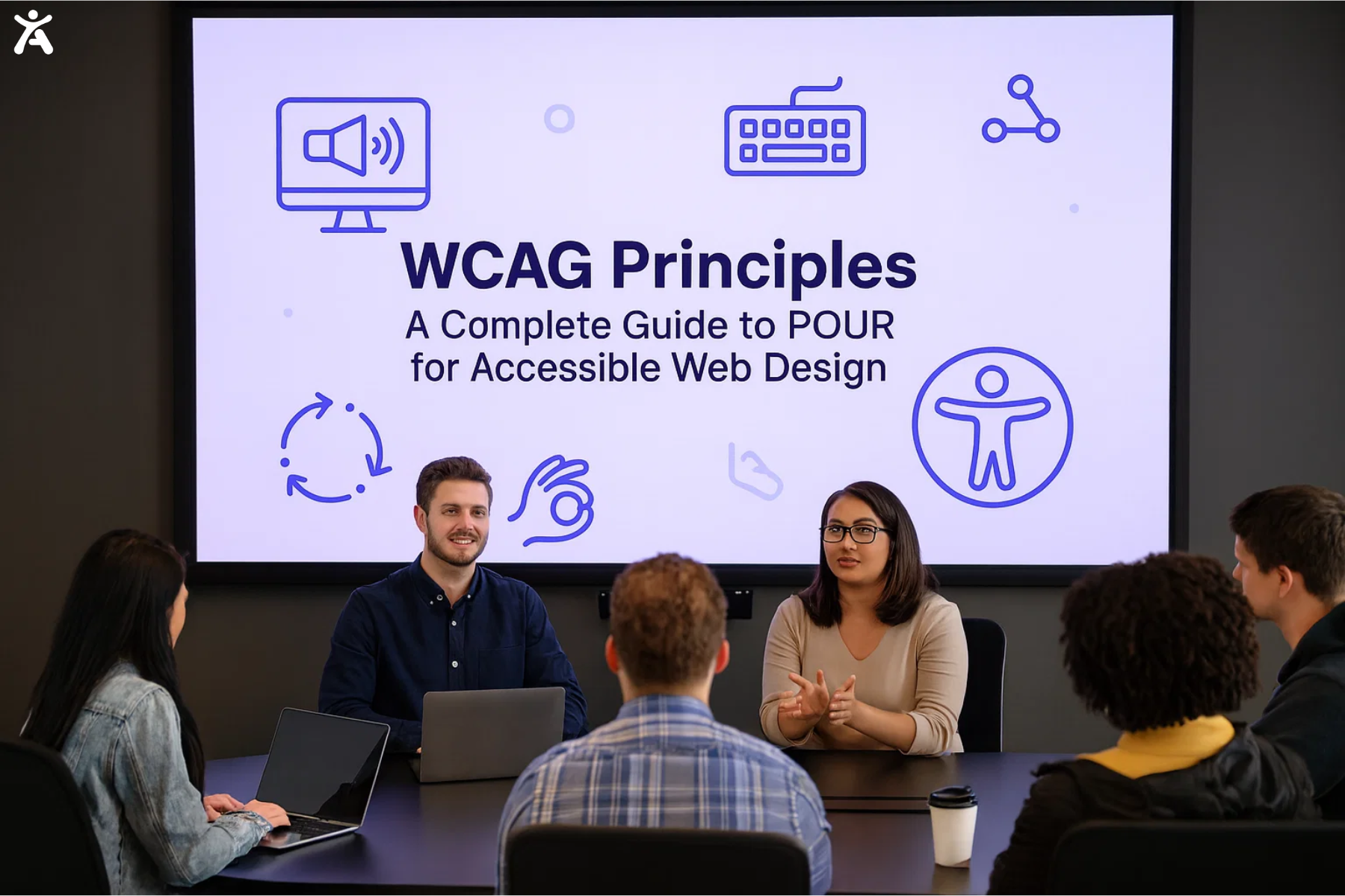
The Four P.O.U.R. Principles of WCAG
WCAG is structured around principles that ensure accessible web content for all. To be accessible, content must be:
- Perceivable: Content must be presented in ways users can perceive, regardless of their sensory abilities. For example, images need text alternatives so blind users can understand them through a screen reader.
- Operable: All interactive elements must function properly with various input methods, including keyboards and assistive devices.
- Understandable: Content and interface behavior should be clear, predictable, and easy to follow.
- Robust: Content must be robust enough to work reliably across all user agents, including assistive technologies, to ensure seamless accessibility. It should use clean, valid code and adhere to web standards, ensuring it remains accessible as technology evolves.
Usability vs. Accessibility
While related, usability and accessibility are distinct concepts. Accessibility ensures people with disabilities can interact with a product, while usability focuses on making that product effective, efficient, and satisfying for all users. A design can be technically accessible yet still have poor usability, such as a screen reader-compatible site that is confusing to navigate. The strongest digital experiences achieve both, delivering seamless and intuitive use for everyone.
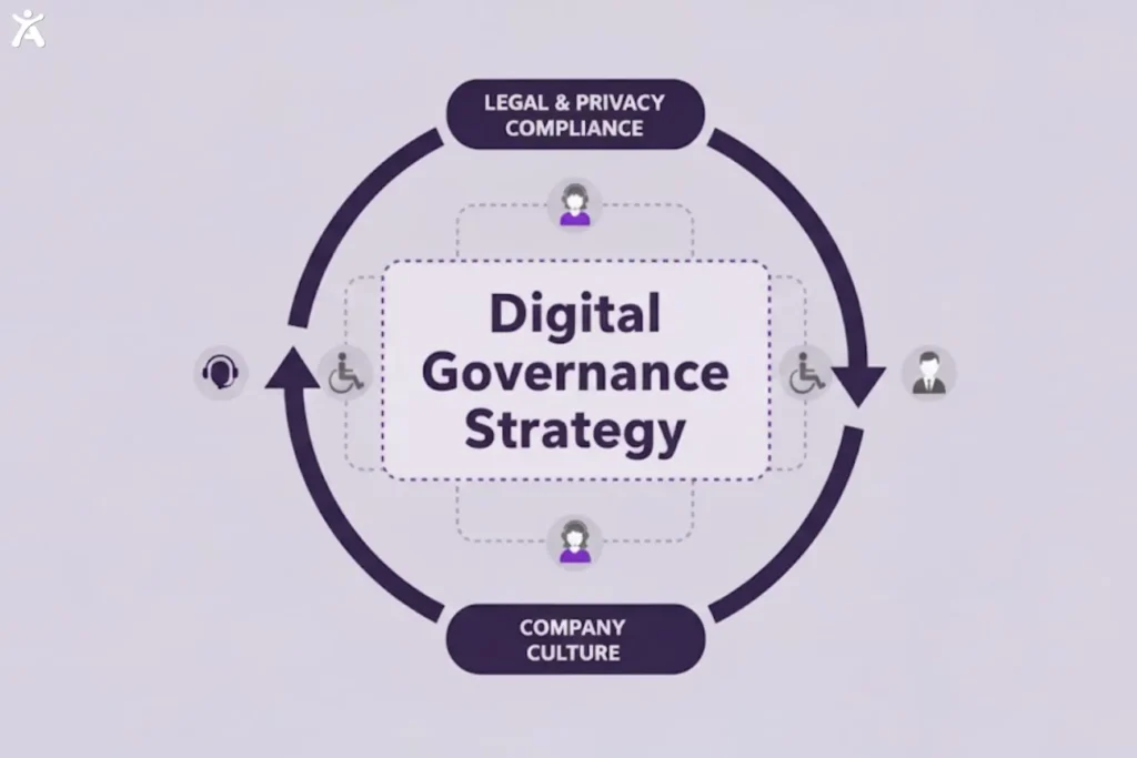
Digital Governance
Digital governance refers to the way an organization manages its digital presence through established policies, standards, and processes. A strong governance strategy embeds accessibility across the entire product lifecycle, from early concept to launch and ongoing maintenance. This approach integrates accessibility into the company culture, supporting compliance with legal and privacy requirements.
Accessible Visual Design for All Users
Users must be able to perceive content for it to be accessible, and visual design plays a central role in that. Key visual design elements help make content clearer for people with visual impairments, including those with low vision and color blindness.
Visual Presentation
Visual presentation is the way content is arranged and styled on a page. For accessibility, it cannot be the only method of conveying information. Relying solely on color or layout can cause users to miss important cues, such as an error message shown only in red. Using color alongside an icon or text label ensures the message is clear and concise. Strong visual presentation makes content easier to understand and helps assistive technologies interpret its structure.
Color & Contrast
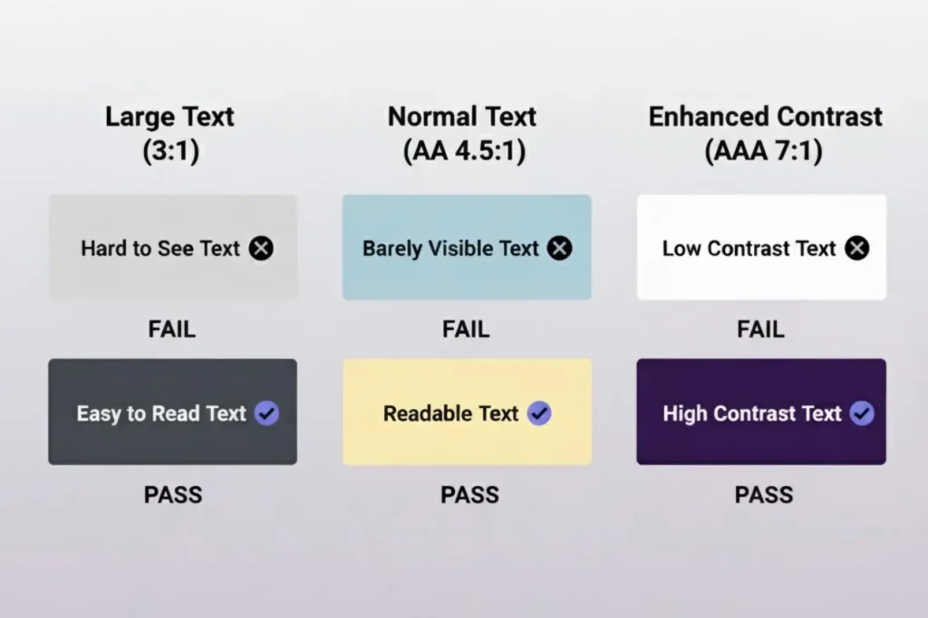
Color and contrast are essential for readability, especially for users with low vision or color blindness.
- Color Contrast: The difference in brightness between text and background ensures readability. WCAG recommends a ratio of 4.5:1 for normal text and 3:1 for large text.
- Color Blindness: Users with this condition often struggle to distinguish colors like red and green, so you should never rely on color alone to convey information. A Color Contrast Analyzer helps you verify compliance by checking RGB values. Tools like Accessify add automated contrast tuning, readability controls, and built-in scans to catch accessibility issues early.
Images of text
Images of text are raster images made of pixels rather than selectable text. They create accessibility barriers because screen readers cannot read them, and users cannot resize or customize them to meet their personal needs. For example, high-contrast requirements cannot be applied to text within an image. Using actual HTML text styled with CSS ensures content remains flexible and accessible to all users.
Reflow
Reflow is the ability of content to adjust and adapt to different screen sizes or zoom levels. It is essential for users who need text magnification, especially on mobile devices. WCAG requires content to reflow into a single column at 400% zoom without horizontal scrolling. This single-column layout allows users with low vision to read line by line without panning, ensuring layouts remain responsive and adaptable to different user needs.
Large Print
Large print is text larger than standard sizes, aiding users with low vision. Designers must ensure that interfaces support larger fonts without compromising layout integrity. WCAG defines large text as 18 points (24 pixels) or 14 points (19 pixels) bold. Flexible layouts that accommodate large print improve the experience for many users.
Flash Thresholds
Some users have photosensitive epilepsy and can have seizures from flashing or blinking content. WCAG limits flashes to no more than three per second, and if exceeded, the flash must stay below the general and red thresholds, known as the “Three Flashes or Below Threshold” rule. Designers should avoid rapid flashing animations or videos, but if used, they must stay within safe limits to prevent harmful reactions.
Creating Understandable Structure and Content
A well-structured design is clear and easy to follow. Logical content organization helps all users navigate more easily, especially those using assistive technologies like screen readers. The next section defines key terms for building a clear content hierarchy and offers accessible alternatives for non-text content.
Headings and Labels
Headings and labels create a clear, navigable structure, acting as signposts for users.
- Headings: Use a logical hierarchy (H1, H2, H3, etc.) so that screen reader users can easily navigate sections. Each page should have one H1, followed by H2s for main sections and H3s for subsections.
- Form Fields and Labels: Every form field must have a clear, linked label. A clear label informs screen reader users about the information they need to enter. Placeholder text alone does not replace a proper label.
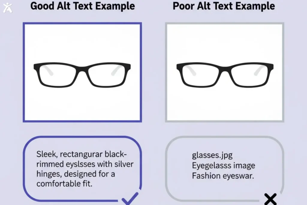
Text Alternatives
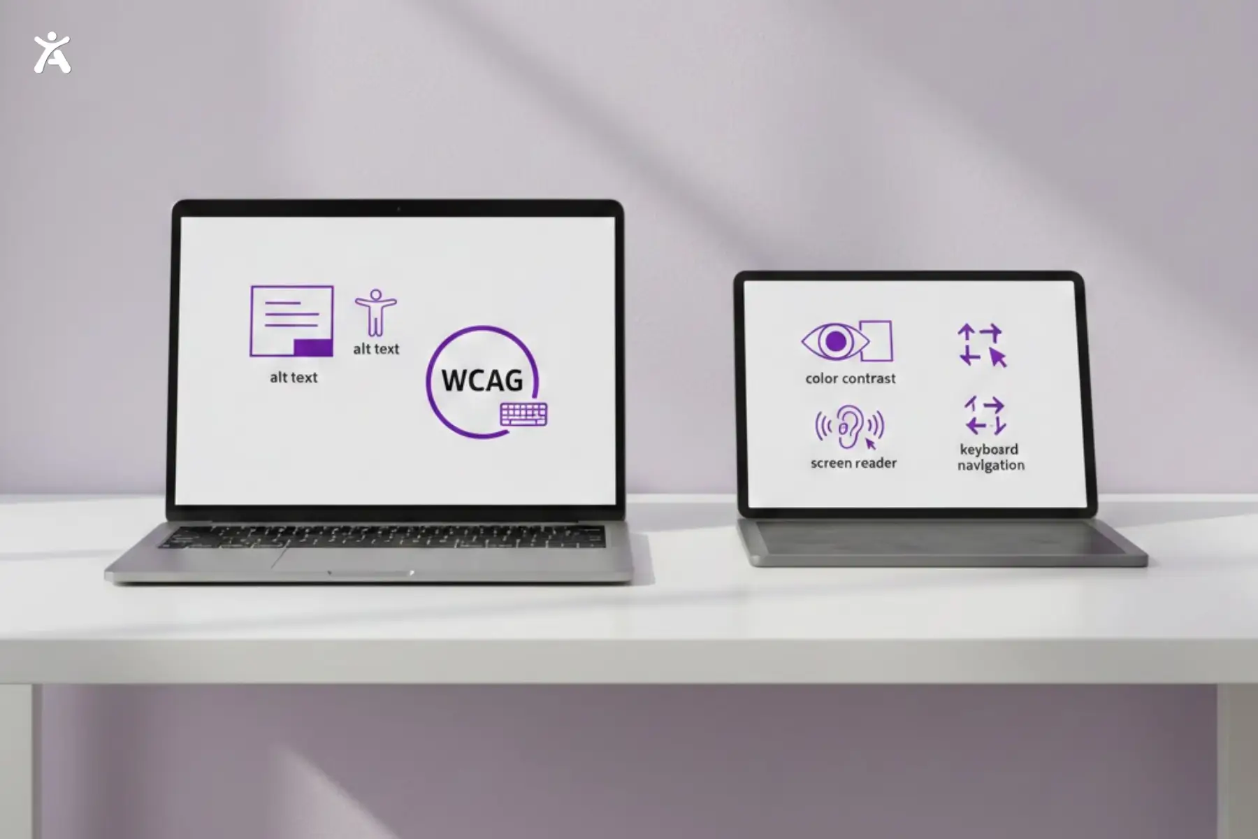
Text alternatives, also known as alt text, provide a textual equivalent for non-text content, such as images, charts, and icons. They are essential for blind users who rely on screen readers, as the alt text is read aloud to describe the content. Effective alt text is concise and conveys the same meaning and intent as the original visual element.
Time-based Media Accessibility
Time-based media includes audio and video content, which should offer accessible options for all users.
Video Captioning: Captions provide synchronized text for spoken dialogue and non-speech audio, essential for users who are deaf or hard of hearing.
Audio Description: A separate narration track describes key visual information for users who are blind or have low vision. Extended descriptions are required when visual details cannot be conveyed during video pauses.
Transcripts: Full-text versions include dialogue and descriptions of visual information, supporting users including those who are deaf-blind.
Sign Language Interpretation: Incorporating sign language, such as ASL or Irish Sign Language, ensures deaf users who rely on these languages can fully understand and engage with content.
Alternate Formats
Providing content in alternate formats ensures accessibility for all users. Complex infographics should include a text description or data table, and PDFs should be made available as HTML pages for improved accessibility. Offering alternative formats demonstrates inclusivity and addresses the diverse needs of users.
What are Interaction and Operability in Web Accessibility?
Operability is a core accessibility principle that ensures all users can interact with and navigate a website. Content must be not only perceivable but also fully operable, including buttons, links, and forms. This section defines key terms for designing a user interface compatible with various input methods.
Keyboard Accessibility

A key web accessibility rule is that all features should work with a keyboard interface, supporting users with motor disabilities who cannot use a mouse.
Keyboard Accessible: Test your site by navigating with the Tab key to ensure that every interactive element, including links, buttons, and form fields, can be reached.
No Keyboard Trap: Make sure users can move out of any focused element, avoiding keyboard traps where they become stuck on a component.
Focus Visible
Focus visible indicates which part of the user interface is active during keyboard navigation, typically shown as a border or outline around a link or button when it is tabbed to. A clear focus indicator helps sighted keyboard users understand their exact location on the page. Designers should ensure the focus indicator is easy to see and has strong color contrast. If the default focus outline is removed, designers must provide a clear, highly visible alternative.
Pointer Gestures
Pointer gestures are interactions using a mouse, trackpad, or touchscreen. While swiping and pinching are common on mobile devices, not all users are able to perform them. Accessibility guidelines require that any functionality needing a complex gesture, such as a two-finger pinch-to-zoom, must also be operable with a single pointer action like a tap. Providing a single-pointer alternative ensures that users with motor impairments can access all features.
ARIA (Accessible Rich Internet Applications)
ARIA is a set of attributes added to HTML elements to enhance accessibility, especially for complex interface components. When standard HTML cannot fully define a UI element’s role, state, or properties, ARIA provides additional semantic information for assistive technologies, such as screen readers. It is useful for custom elements such as dropdowns or sliders, helping users understand and interact with dynamic content. Correct ARIA usage is crucial, as improper implementation can create additional accessibility barriers.
Form Fields & Labels
Accessible forms are crucial for websites that require user input. Each input field must have a programmatically associated label so screen readers can announce its purpose. Placeholder text is not a substitute for a visible label. Error messages should be clearly communicated and linked to the relevant fields to guide users effectively.
Call to Action (CTA)
A Call to Action is an interactive element, like a button or link, that prompts a specific user action. For accessibility, the CTA’s purpose must be clear from its text alone. Avoid vague phrases such as “Click Here” or “Learn More” and use descriptive text like “Read our full accessibility statement” or “Sign up for our newsletter” so screen reader users understand the link’s context without relying on surrounding content.
Content on Hover or Focus
Sometimes additional content appears when a user hovers over or focuses on a UI component. WCAG requires this content to meet specific accessibility criteria.
- Users must be able to dismiss additional content without needing to move the mouse or change keyboard focus, for example, by pressing the Escape key.
- Users must be able to move their pointer over the content without it disappearing.
- Content should remain visible until the user either moves the focus or dismisses it, ensuring that users with low vision have sufficient time to read it.
Understanding Diverse Users and Assistive Technologies
Designing inclusive products requires understanding how people interact with the web and the assistive technologies they use. It also involves recognizing disabilities that may affect their user experience.
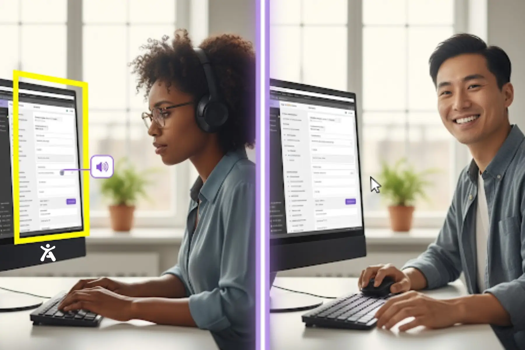
Assistive Technologies
Assistive technologies (AT) are hardware or software that help people with disabilities interact with digital content. Designers do not need to master every aspect of AT, but should have a basic awareness of it.
- Screen Readers: Read screen content for users who are blind or have low vision.
- Screen Magnifiers: Enlarge portions of the screen for users with low vision.
- Speech Recognition Software: Allows users to control computers and dictate text using voice, aiding those with motor disabilities.
- Alternative Input Devices: This includes switches, head wands, and eye-tracking systems for users who are unable to use a standard keyboard or mouse.
- Braille Displays: Convert on-screen text into Braille for users who are blind or deaf-blind.
Disability Categories & Design Considerations
Disabilities can be permanent, temporary, or situational, and accessible design should consider the full spectrum of these conditions.
Visual: Blindness, low vision, color blindness.
Auditory: Deafness, hard of hearing.
Motor: Limited mobility, paralysis, or tremors affecting mouse or keyboard use.
Cognitive: Learning disabilities, memory impairments, attention disorders.
Understanding these categories helps anticipate accessibility barriers and guide better design decisions. Research from the National Institute on Disability, Independent Living, and Rehabilitation Research, part of the U.S. Department of Health and Human Services, supports this approach.
User Experience
User Experience (UX) encompasses all interactions a person has with a company, its products, and services. Accessibility is a key component of UX. Inaccessible products frustrate users with disabilities and create exclusion. Prioritizing accessibility enhances the experience for a broader audience and often yields a more intuitive, user-friendly design for all.
Integrating Accessibility into the Design Workflow
Accessibility should be part of every step in the design process, not a final checklist item. It should begin with the initial sketch and continue through to the final prototype. This approach ensures accessibility becomes a natural part of the workflow.
Design System
A design system is a set of reusable components organized by clear guidelines. Integrating accessibility ensures components like buttons, forms, and menus are usable from the start, enabling every team that uses them to create more inclusive products. The system should include accessibility documentation and guidelines for each component.
Prototyping Accessible Designs
Prototyping is when ideas take shape, making it the ideal stage to address accessibility.
- Check color contrast ratios early.
- Annotate designs with heading levels, alt text for images, and ARIA roles for custom components.
- Plan keyboard navigation order to ensure smooth tabbing through the interface.
- Use prototyping tools that support accessibility features.
Identifying issues at this stage is easier and less costly than fixing them after development has begun.
Responsive Design
Responsive design ensures layouts adapt to all screen sizes, from large desktops to small mobile devices. It supports the reflow principle, preventing horizontal scrolling when users zoom in and keeping content readable and functional. This adaptive behavior is particularly important for users with low vision or those who use screen magnifiers.
Progressive Enhancement
Progressive enhancement is a web design strategy that begins with essential content and functionality, ensuring compatibility across all browsers and devices, while also allowing for future enhancements. Advanced features are added for browsers that support them, creating robust and accessible products. Building an accessible foundation first ensures everyone can access core content, regardless of device or assistive technology.
User Testing with Diverse Users
Real-world feedback is crucial. Testing with users who have disabilities reveals accessibility barriers and offers insights designers might miss. Include users who rely on screen readers, keyboard navigation, and other assistive technologies to ensure your product is fully accessible. Their feedback is essential for creating an inclusive experience.
Web Technology
Understanding HTML, CSS, and JavaScript enables designers to create practical and accessible solutions. Knowing how designs are translated into code improves communication with developers and ensures the final product accurately reflects the intended inclusive design.
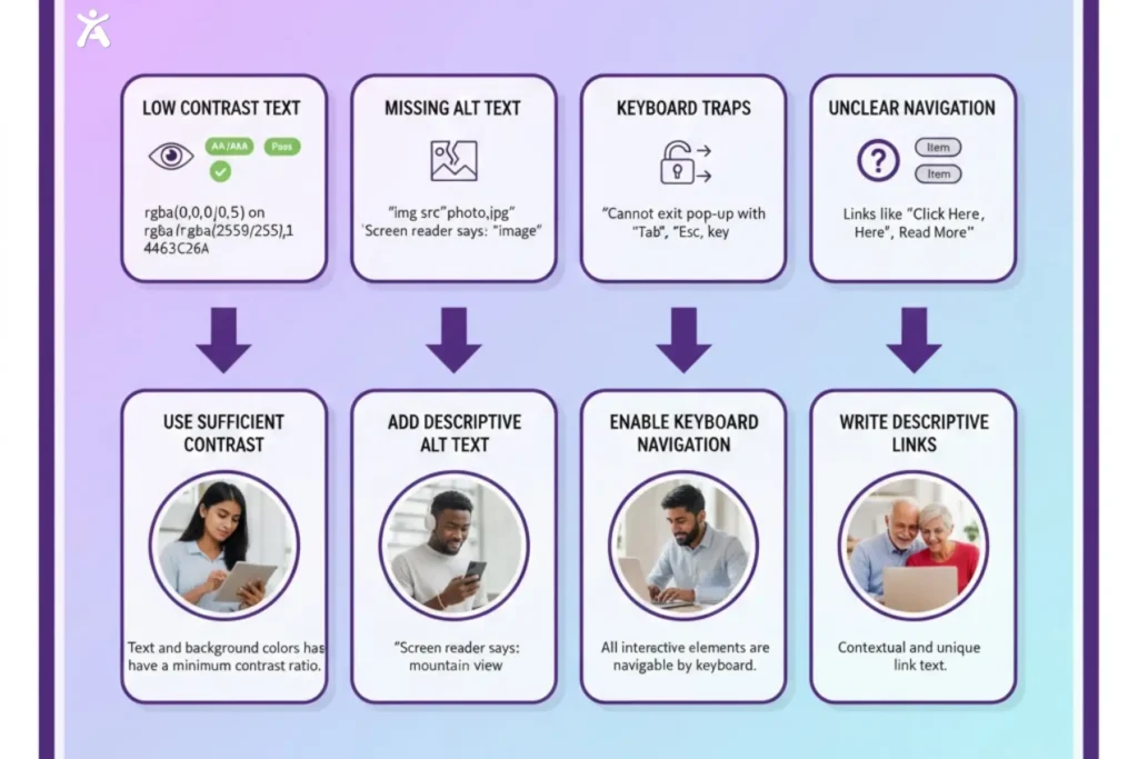
Accessibility Barriers
Accessibility barriers prevent people with disabilities from using a website or app. They include poor color contrast, missing text alternatives, complex navigation, and keyboard traps. Designers should identify and remove these barriers during the design process to create a smoother and more inclusive experience for all users.
Final Thoughts
This accessibility glossary underscores the designer’s role in creating an inclusive web. Accessibility ensures digital experiences are perceivable, operable, understandable, and robust for users with visual, auditory, motor, and cognitive disabilities.
Focus on one or two principles, such as color contrast and keyboard navigation. Utilize tools such as color contrast checkers and screen readers, advocate for inclusive design within your team, and continually learn from resources like the W3C Web Accessibility Initiative, WCAG 2.1 Guidelines, and the A11y Project. Embracing accessibility creates a digital world open to all.
FAQs
Accessibility ensures people with varying abilities can interact with a product, while usability focuses on making it easy and efficient for everyone. This distinction is often explained in an accessibility glossary for clarity and understanding.
Use a color contrast checker or Accessify to identify barriers. These tools ensure text and background colors meet WCAG standards, making content readable for all users.
Not all images need alt text. Decorative images should have empty alt attributes, while informative images must include clear descriptive text. Providing the correct type of alt text ensures screen readers deliver the intended information to people who rely on assistive tools.
Removing the default focus outline is not recommended unless it is replaced with a visible and accessible alternative. Using a clear, accessible focus indicator helps keyboard users navigate and interact with your site, maintaining a barrier-free experience for all users.
Headings give structure to content and help users navigate pages easily. Tools like Axe and Lighthouse, together with Accessify, simplify compliance monitoring and ensure everyone, including screen reader users, can understand the content.

