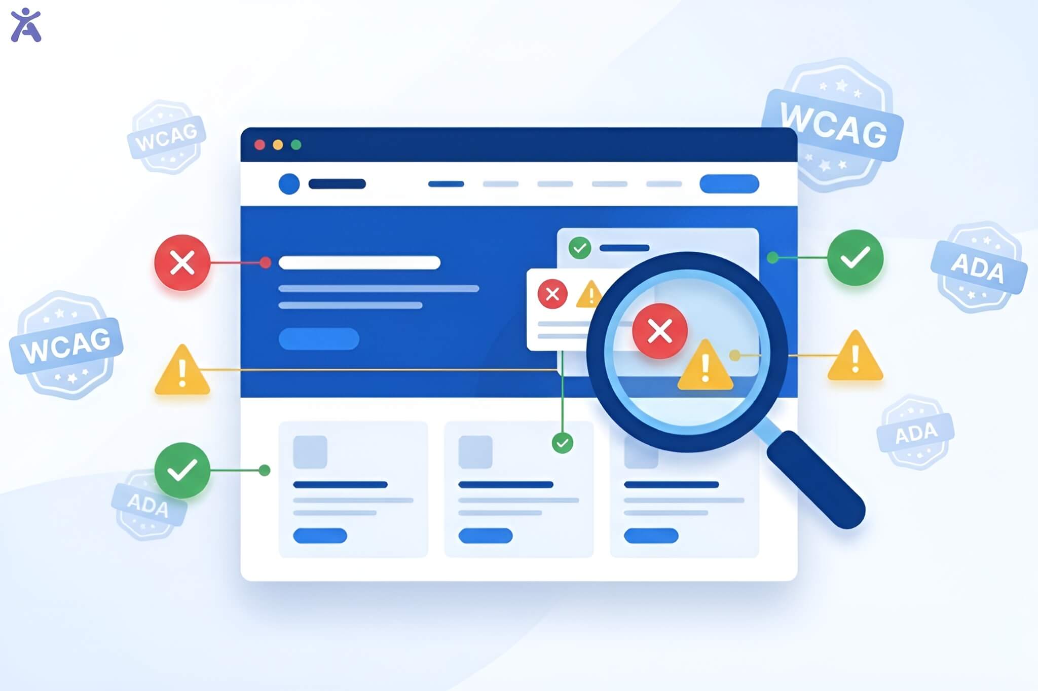

How can we ensure every user regardless of ability can navigate, understand, and interact with our digital products? The answer is in Accessibility in web design. It has changed from an afterthought to a must-have for today’s websites and apps.
I’ve spent over a decade designing digital experiences for Fortune 500 companies and small startups alike. A button that’s perfectly visible to you might be invisible to someone using a screen reader. A form that seems straightforward could be a maze for users with cognitive disabilities. These aren’t edge cases; they’re real people trying to access your content right now.
Quick Summary
This comprehensive guide translates Web Content Accessibility Guidelines into actionable design practices. You’ll see how the POUR principles; Perceivable, Operable, Understandable, and Robust affect every design choice. This includes picking color contrasts and organizing form fields. We’ll look at practical ways to implement strategies throughout the development lifecycle. We’ll also check out testing methods. Plus, we’ll show how accessibility in web design boosts user satisfaction and adds real business value.
The Imperative for an Accessible Web
Over one billion people worldwide live with some form of disability, representing roughly 15% of the global population. If your website isn’t accessible, you might lose one in seven visitors before they see your content.
In a recent project for a healthcare platform, I saw a user with motor impairments struggle for five minutes to click a small button. This task would have taken seconds if the touch target was sized correctly. That moment reinforced why Web Accessibility isn’t optional; it’s essential.

Legal landscapes are shifting too. In the United States, ADA-related website lawsuits have surged by over 300% in recent years. Businesses now face settlements between $50,000 and several million dollars for sites that don’t comply.
A Proactive Stance: Building Accessibility from Day One
Here’s a costly mistake I see design teams make often: treating accessibility like a checkbox task after development is done. Retrofitting accessibility into a finished product costs 3 to 5 times more than building it in from the start.
When you integrate accessibility guidelines early, you’re enhancing creativity. The best accessible designs I’ve created weren’t compromises. They were improvements that benefited everyone. Clear navigation helps users in a hurry. Good color contrast works better in bright sunlight. Keyboard navigation speeds up power users’ workflows. Captions benefit commuters, office workers, and non-native speakers.
Understanding the Foundation
Before we start on implementation tactics, let’s set the framework for accessibility decisions.
The Four Foundational Principles (POUR)
The Web Content Accessibility Guidelines are based on four key pillars. These pillars guide all accessibility choices.
Perceivable means users must be able to perceive information through at least one of their senses. A blind user can’t see your images, but they can hear alt text read aloud. Someone with hearing loss can’t hear your podcast, but they can read a transcript.
Operable ensures users can interact with all interactive elements regardless of their input method. At a local community center workshop, I met a participant who couldn’t use a mouse due to arthritis. Without keyboard navigation, the entire web page was unusable for them.
Understanding requires that both information and operation are clear and predictable. I learned this lesson when 40% of users abandoned a checkout form because error messages appeared at the page top while form fields scrolled below. They never connected the dots.
Robust means content works across diverse assistive technology and user agents. Your beautiful site might look perfect in Chrome, but if it breaks in a screen reader, you’ve failed a significant portion of your audience.
WCAG Hierarchy and Guidelines to Conformance
The WCAG structure operates on three levels: guidelines, success criteria, and conformance levels. Think of guidelines as broad goals, success criteria as testable checkpoints, and conformance levels as achievement tiers.
Level A represents the bare minimum. Fail these and your site has serious accessibility barriers. Level AA is the sweet spot most organizations target, balancing thoroughness with feasibility. Level AAA is the gold standard. However, the W3C Recommendation notes that meeting all AAA criteria for a whole site isn’t always possible.
For most projects, I recommend targeting WCAG 2.1 Level AA conformance. It covers the vast majority of accessibility needs without requiring extreme measures.
Integrating WCAG into a Modern Design Workflow
Theory matters, but implementation determines success. Let’s look at how to include accessibility in web design from start to finish in your creative and development process.
Accessibility as a Core Design Principle
Accessibility in web design transforms when you treat it as a core design principle, not a compliance checklist. In my design work, I’ve noticed that setting accessibility rules early speeds up decision-making.
Start with your color palette before finalizing brand colors. I redesigned the color scheme for an e-commerce client. Their signature light blue didn’t meet contrast requirements. The new palette looked better and worked for everyone.
Consider touch targets from the beginning. Mobile devices require minimum 44×44 pixel tap areas, a requirement that naturally leads to cleaner, less cluttered interfaces.
Accessibility Throughout the Development Lifecycle
Breaking accessibility into isolated “accessibility sprints” never works. I’ve seen teams scramble to retrofit ARIA labels days before launch, creating buggy experiences that cost 5-10x more.
During wireframing, map out heading structures and landmark regions. In visual design, test with grayscale versions and color blindness simulators. During development, use semantic HTML first, ARIA attributes second. In QA testing, dedicate time to keyboard navigation and screen reader testing.
Ensuring Everyone Can Access Information
Making content perceivable seems obvious until you realize how many ways users might perceive your website differently.

Achieving Optimal Visual Clarity and Contrast
Color contrast represents one of the most measurable aspects of Web Accessibility. WCAG success criteria specify minimum contrast ratios: 4.5:1 for normal text, 3:1 for large text, and 3:1 for user interface components.
These numbers are based on vision science research. I use browser extensions like Accessify app for contrast checker during design, testing every text-background combination before committing.
Beyond minimum requirements, consider context. Text overlaid on images needs even higher contrast. One solution I frequently implement: semi-transparent background panels behind text, ensuring consistent contrast regardless of the underlying image.
Don’t rely on color alone to convey information. When designing status indicators, I pair color with icons and text labels. A green “Success” checkmark and red “Error” X work for colorblind users, while color-only indicators fail.
Providing Robust Text Alternatives
Alt text remains the foundation of accessible web content. The key insight: describe the function and context, not just the appearance.
- For decorative images, use empty alt attributes (alt=””) so screen readers skip them
- For functional images like buttons, describe the action: “Submit form” not “Blue arrow”
- For informative images, describe the meaning: “Bar chart showing 45% increase in sales”
- For complex infographics, provide comprehensive descriptions adjacent to the image
I recently audited a news site where every image had alt=”image” technically present but completely useless. After training their content authors on writing meaningful text alternatives, user feedback from screen reader users improved dramatically.
Making Time-Based Media Accessible
Video and audio present unique challenges. Captions benefit not just deaf users but anyone in sound-sensitive environments commuters, office workers, non-native speakers.
Provide synchronized captions for all video content. Auto-generated captions need human review. I’ve seen auto-captions turn technical terminology into gibberish.
Audio description fills gaps for blind users by narrating visual information during natural pauses. For a nonprofit client’s fundraising video, we added extended audio description that brought the emotional storytelling to life for blind viewers.
Adaptable Presentation and Responsive Design
Content must remain accessible when users customize their experience. Test your layouts at various zoom levels (100%, 150%, 200%, 400%) and viewport sizes.
I use relative units (rem, em, percentages) instead of fixed pixels. This simple practice ensures layouts adapt gracefully when users adjust default font sizes, a common accommodation for aging eyes.
Operable Interfaces
Beautiful designs mean nothing if users can’t interact with them.

How Can Keyboard Navigation Transform User Experience?
Comprehensive keyboard navigation means users can reach and interact with every interactive element using only their keyboard. The fundamental rule: if you can click it, you should be able to reach it with Tab and activate it with Enter or Space.
Focus indicators must be visible and clear, meeting the 3:1 contrast ratio requirement. Never remove focus outlines without providing equally visible alternatives.
Tab order should follow logical reading order. I’ve audited sites where tabbing jumped chaotically because developers relied on CSS positioning without considering HTML source order.
Designing for Diverse Input Modalities
Modern interfaces support touch, mouse, keyboard, voice, and assistive technology. Your web page needs to work with all input modalities.
For touch interfaces, ensure pointer gestures have keyboard-accessible alternatives. That swipe-to-delete feature? Add a visible delete button. Make clickable areas generous (minimum 44×44 pixels) and separate interactive elements with adequate spacing.
I once redesigned a mega-menu that only appeared on hover. Touch screen users couldn’t access it at all. The solution making submenus toggleable with clicks worked better for everyone and increased mobile conversion rates by 18%.
Managing Time Limits and Dynamic Content
Auto-updating content and time limits create obstacles for users who read slowly or use assistive technology. Give users control over timing whenever possible.
For session timeouts, warn users before time expires and allow extensions. One banking client initially logged users out after 10 minutes with no warning. We extended the timeout and added a clear warning dialog complaints dropped 90%.
Auto-playing content disrupts screen reader users. Provide pause, stop, or hide controls for anything that moves, blinks, or auto-updates for more than five seconds. This includes carousels, news tickers, and video backgrounds.
Preventing Seizures and Physical Reactions
Flashing content can trigger seizures in people with photosensitive epilepsy. WCAG defines specific flash thresholds: nothing should flash more than three times per second.
During a product launch review, an animated background effect flashed rapidly at 6 times per second. We caught it in testing and redesigned it immediately.
Avoid parallax effects that create strong motion illusions through large screen portions. These can trigger vestibular disorders. When using animation, respect the prefers-reduced-motion media query.
Understandable Information & Interaction
Even perceivable, operable content fails if users can’t understand it or predict how it behaves.
Designing for Readability and Predictability
Clear, predictable interfaces reduce cognitive load for everyone. Keep language simple and direct. Industry jargon alienates users. When technical terms are necessary, define them on first use.
Maintain consistent navigation menus across your site. Users build mental models of where things live. I’ve tested sites where the navigation menu changed based on page type users consistently got lost and converted 40% less.
Predictable functionality matters too. Links should look like links, buttons like buttons. Surprising behavior creates confusion and distrust.
Input Assistance and Robust Error Handling
Form fields represent a common frustration point. Every form field needs a persistent visible label, not just placeholder text that disappears.
For complex requirements, provide instructions before the field. If your password needs 12 characters including special symbols, say so upfront. Error rates dropped 40% simply by improving error messages and adding inline help text.
Reducing Cognitive Load and Addressing Barriers
Cognitive accessibility impacts users with dyslexia, ADHD, autism, and age-related cognitive changes. Break content into digestible chunks with clear headings. Nobody reads walls of text scan-friendly content helps everyone.
Limit working memory demands. Multi-step processes should show progress indicators and allow users to review previous steps. For an e-commerce checkout, displaying completed steps helped users maintain context and improved completion rates by 22%.
Robust Design Building for Compatibility
Robust code works reliably across diverse user agents and assistive technology.
Semantic HTML and Assistive Technology Compatibility
Semantic HTML forms the foundation of robust web content. When you use proper HTML elements instead of generic divs, assistive technology understands your content structure automatically.
Use header tags (H1-H6) to create logical document outlines. Screen reader users navigate by headings. Every web page should have exactly one H1, followed by properly nested subheadings.
Landmarks (header, nav, main, aside, footer) segment pages into regions. Screen reader users can jump between landmarks, bypassing repetitive content.
Form elements, buttons, and links have built-in accessibility. A proper button element is keyboard accessible and works with assistive technology out of the box.
Adhering to Modern Web Standards and Technologies
Building with current web standards ensures compatibility across devices. Validate your HTML and CSS using W3C validators. Invalid markup causes unpredictable behavior in assistive technology.
Follow ARIA authoring practices when extending HTML semantics. ARIA is powerful but dangerous incorrect usage makes things worse. The first rule of ARIA: don’t use ARIA if native HTML does the job.
Progressive Enhancement and Graceful Degradation
Build core functionality in HTML, enhance with CSS, add interactivity with JavaScript. This layered approach ensures basic accessibility even when advanced features fail.
JavaScript enables rich interactions but introduces fragility. What happens when your script doesn’t load? If critical functionality breaks, you’ve failed accessibility. Core content and navigation should work without JavaScript.
Practical Application and Continuous Improvement
Theory matters, but practical implementation determines whether your sites actually work for real users.
Integrating Accessibility into Design Systems
Design systems are powerful tools for scaling accessibility in web design across organizations. When you build accessibility into reusable components, every implementation inherits those features.
Document accessibility features in your component library. For each component, specify keyboard interactions, ARIA attributes, and screen reader behavior.
Testing and Validation for WCAG Conformance
Automated tools catch obvious issues but only identify about 30% of accessibility problems. You need layered testing strategies. Start with automated scanners like Accessify. Run these during development to catch low-hanging fruit. Integrate them into CI/CD pipelines.
Manual testing catches what automation misses. Navigate your site with only a keyboard. Run it through screen readers. Test with browser zoom at 200%. The gold standard: testing with actual users who have disabilities. Watching someone navigate your site with a screen reader reveals issues you’d never anticipate.
Conduct regular accessibility audits, especially after major updates. I recommend quarterly comprehensive reviews at minimum.
How Can Accessibility Drive Business Value?
Beyond legal compliance, accessibility in web design delivers measurable business benefits.

Enhancing User Experience for All
Accessible design is good design. Features built for users with disabilities improve experiences for everyone:
- Captions help commuters watching videos on mute
- Voice controls assist drivers and multitasking parents
- Clear navigation benefits rushed shoppers and first-time visitors
- High contrast improves readability in bright sunlight
One retail client saw cart abandonment drop 25% after improving form accessibility. Clearer labels and better error handling helped all users’ complete checkout faster.
Search engines favor accessible sites. Semantic HTML, descriptive text alternatives, and clear page structures that help screen readers also help search bots.
Expanding Your Online Presence and Market Reach
Making your online presence accessible opens markets you’re currently excluding. The disability community represents significant purchasing power and an estimated $8 trillion in annual disposable income globally.
Your competitors likely have accessibility gaps. Being the accessible alternative in your industry creates competitive advantage. When a major airline finally made their booking flow keyboard accessible, they captured market share from travelers with disabilities who previously couldn’t book directly.
Accessibility overlaps with international audiences. Simple language, clear visuals, and flexible text sizing help non-native speakers and users with varying technology access.
Legal Compliance and Brand Reputation

Digital accessibility lawsuits aren’t slowing down, they’re accelerating. Companies face settlements ranging from $50,000 to several million dollars. Proactive accessibility costs far less than reactive legal defense.
Beyond avoiding lawsuits, accessibility demonstrates corporate values. Brands that prioritize inclusivity attract customers, employees, and partners who share those values. In contrast, accessibility failures become public relations disasters.
Conclusion
Accessibility in web design isn’t heading back to text-only layouts. Modern accessible sites rival or exceed their inaccessible competitors in aesthetics and functionality. Accessify app proving every day that accessibility and innovation coexist beautifully.
Emerging technologies like AI-powered alt text generation and improved voice interfaces make accessibility easier to implement. Staying current with WCAG updates, version 3.0 is on the horizon with refined guidelines addressing mobile and cognitive accessibility.
A Call to Action
Whether you’re a designer or developer, you have the power to make the web more inclusive. Starting small, even improving color contrast or adding alt text helps real people access information they currently can’t reach.
Make accessibility a habit, not a project. Review one page per week. Add accessibility criteria to your definition of done. Test with assistive technology. Listen to users with disabilities.
Key Takeaways to Implement This Week
- Run an automated accessibility scan using Accessify app
- Test keyboard navigation on your main user flows
- Check color contrast ratios using Accessify app tool
- Review and improve alt text on images
- Document one accessibility goal for your next project
Ready to transform your website into an inclusive experience? Contact us at Accessify today for a comprehensive accessibility audit and personalized roadmap to WCAG conformance. We’ll identify specific issues, provide actionable recommendations, and guide your team through implementation. Let’s build a web that works for everyone starting with your website.
FAQs
Using accessibility in web design ensures digital spaces work for all users, including those with disabilities. Strong practices improve navigation, reduce barriers, and support legal compliance while strengthening the overall user experience for diverse audiences.
Only a small share of websites achieves full accessibility compliance, with most failing basic checks like contrast, structure, and keyboard navigation. This gap highlights growing legal exposure and the need for stronger digital accessibility practices across industries.
Investing in accessibility brings wider reach, better usability, and reduced legal risk. It also improves SEO and boosts user trust. Modern tools streamline audits, helping brands deliver inclusive digital experiences without slowing down development workflows.
WCAG introduces structured rules that enhance navigation, readability, and interaction for users with visual, motor, or cognitive challenges. By following these standards, teams build cleaner interfaces, stronger UX, and more resilient products across different devices and environments.
Free testing tools like Accessify app, Axe, and Lighthouse help identify common violations, but pairing them with accessibility in web design resources adds guidance, clarity, and practical fixes that support long-term accessibility across entire websites.