
Responsive Accessibility Widget for Mobile, Tablet & Desktop with Accessify
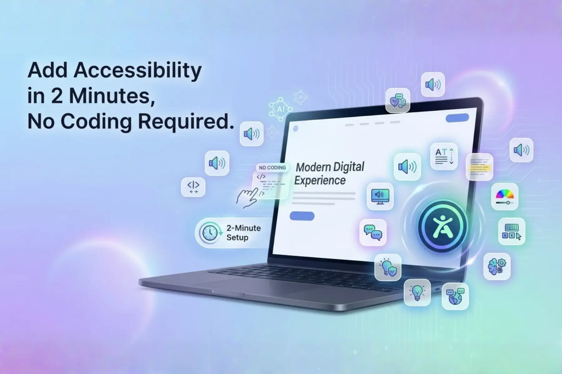
Your accessibility widget breaks on mobile? Not with Accessify’s Responsive Magic. The widget automatically adapts size, position, and behavior across desktop, tablet, and phone screens, no manual breakpoints, no media queries.
Complete a 2-minute setup, customize once, and deploy a buttery-smooth, brand-consistent UX everywhere, driving engagement up to 40% by never getting in the way of your users.
Responsive Crisis: One-Size-Fits-None Accessibility Widgets
Over 60% of web traffic is mobile, yet most accessibility tools fail at responsiveness:
- Desktop-heavy widgets crush mobile layouts
- Mobile-optimized widgets become tiny or unusable on tablets
- CTAs get blocked, text becomes unreadable, usability drops
Accessify’s fluid responsive engine auto-scales intelligently:
- Smart positioning per screen size
- Touch-optimized interactions
- Density-perfect sizing for every device
The result: an accessibility widget that feels native on every screen your visitors use.
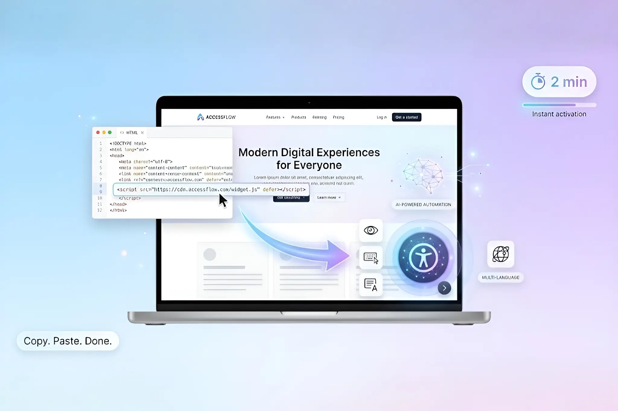
Frictionless Foundation: 2-Minute Responsive Launch
Getting started takes minutes:
- Start a free trial at accessify.app
- Add your site in manage.accessify.app
- Complete 2-minute verification
Your responsive core activates instantly, no extra configuration required.
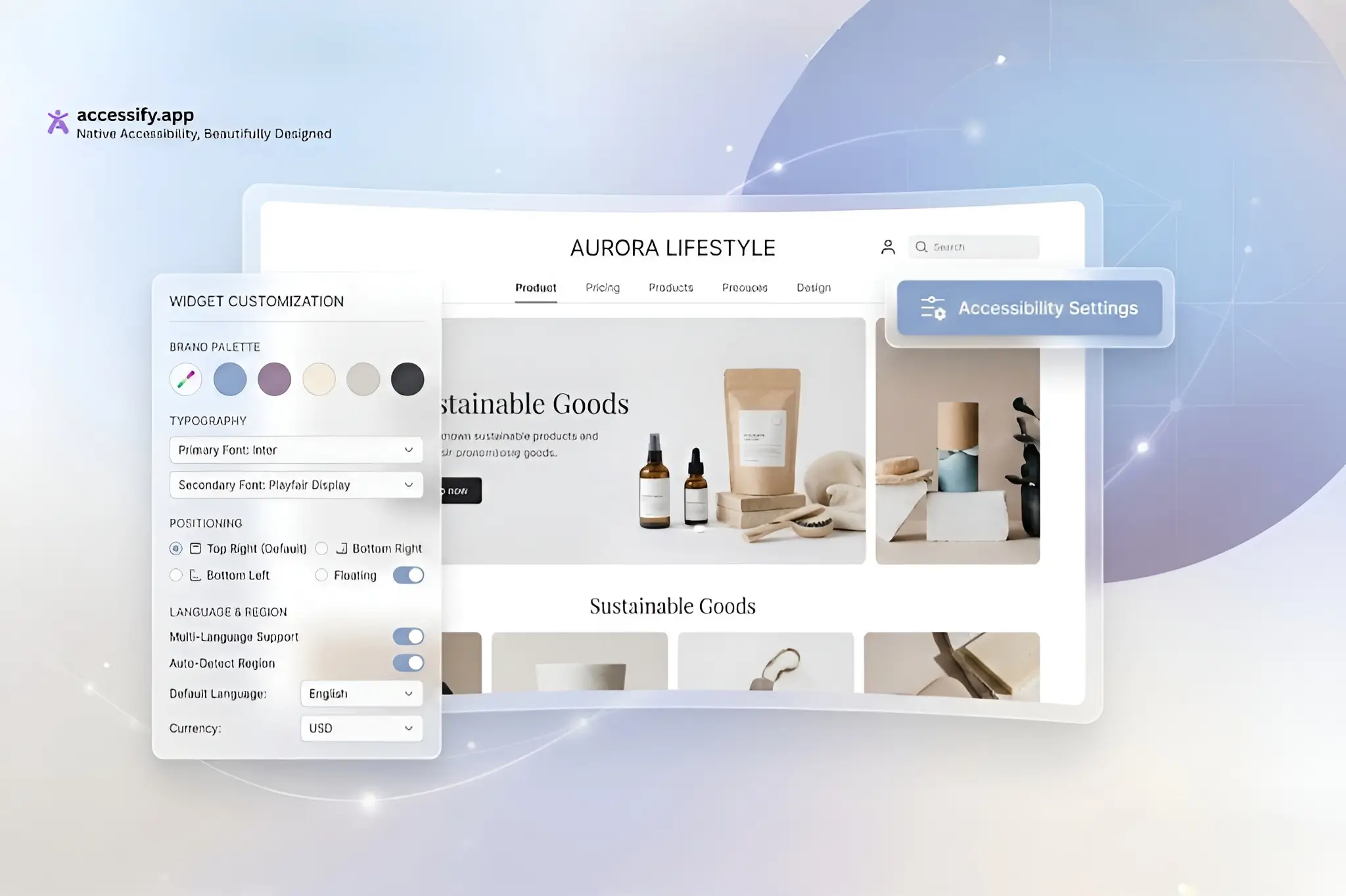
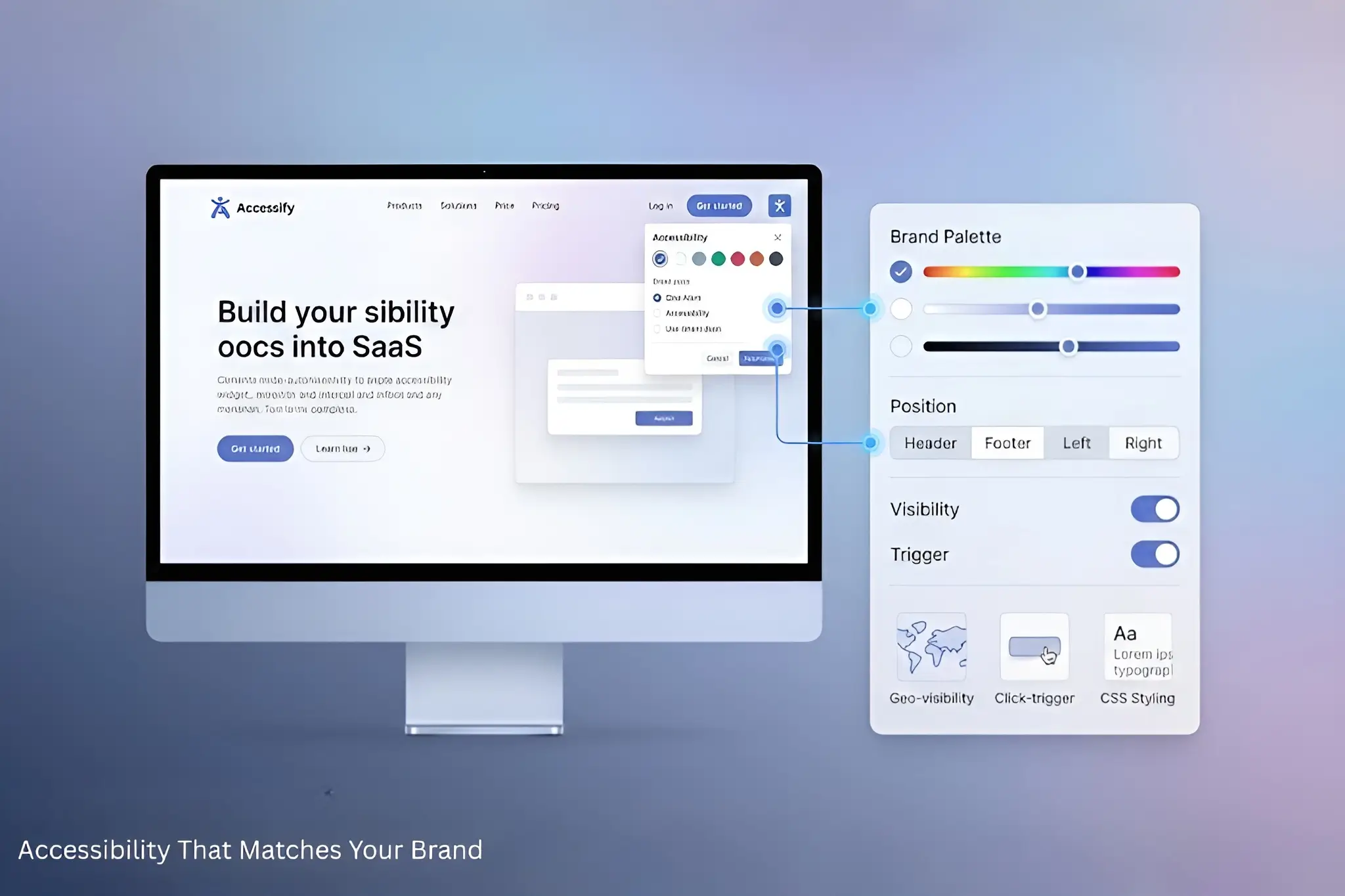
Responsive Customization Masterclass
Settings Headquarters
Dashboard → Click your site URL → Widget Settings page.
Auto-Adaptive Basics
- Position Intelligence:
“Smart-Right” automatically shifts from header → floating → footer based on screen size.
- Size Fluidity:
Icons scale smoothly from 48px → 32px → 24px across desktop, tablet, and mobile.
- Touch Targets:
Minimum 44px tap areas on mobile, hover interactions on desktop, handled automatically.
Precision Controls
- Colors & Icons:
Brand hex colors with device-optimized opacity.
- Geo-Visibility:
Hide or show widgets by country (e.g., EU contrast requirements).
- Breakpoints:
Optional fine-tuning at 768px / 480px if desired.
Power Features (Scroll Down)
- Live Translations:
Enable 30+ languages; language selector shrinks elegantly on mobile screens.
- Trigger Selectors:
Use
.mobile-helpto open a full-screen overlay on phones. - CSS Overrides:
@media (max-width:768px) {
.accessify-widget {bottom:20px;right:20px; }
}
Multi-Device Preview & Deploy
Test live with built-in emulators, iPhone → iPad → Desktop, and deploy with confidence.
Case Study: Travel Site’s Mobile Conversion Leap
Wanderlust Expeditions, an adventure travel company with 70% mobile bookings, struggled with accessibility responsiveness.
Before Accessify
- Desktop: Clean header integration
- Mobile: Oversized button blocked CTAs, 12px text unreadable
- Tablet: Awkward middle-ground experience
Accessify Responsive Fix
- Smart positioning: Header on desktop, floating-right on mobile
- Touch scaling: 52px taps on mobile → 32px on desktop
- Translations: Collapsible flags on mobile
- CSS: Mobile-only bottom-sheet trigger
Results
- Mobile engagement +68% (from 11% clicks)
- Tablet bookings +29%
- Overall UX score: 92/100 across all devices
“Mobile visitors finally use accessibility tools.” , CTO
Responsive Wins with Accessify
- Zero Dev Hours: Automatically handles 95% of responsive cases
- Future-Proof: Works on foldables and emerging form factors
Need responsive help? 24/7 chat support or a design sync is available.
Accessibility That’s Perfect Everywhere
Start your free trial at accessify.app, responsive-ready, brand-aligned, and built for every screen.