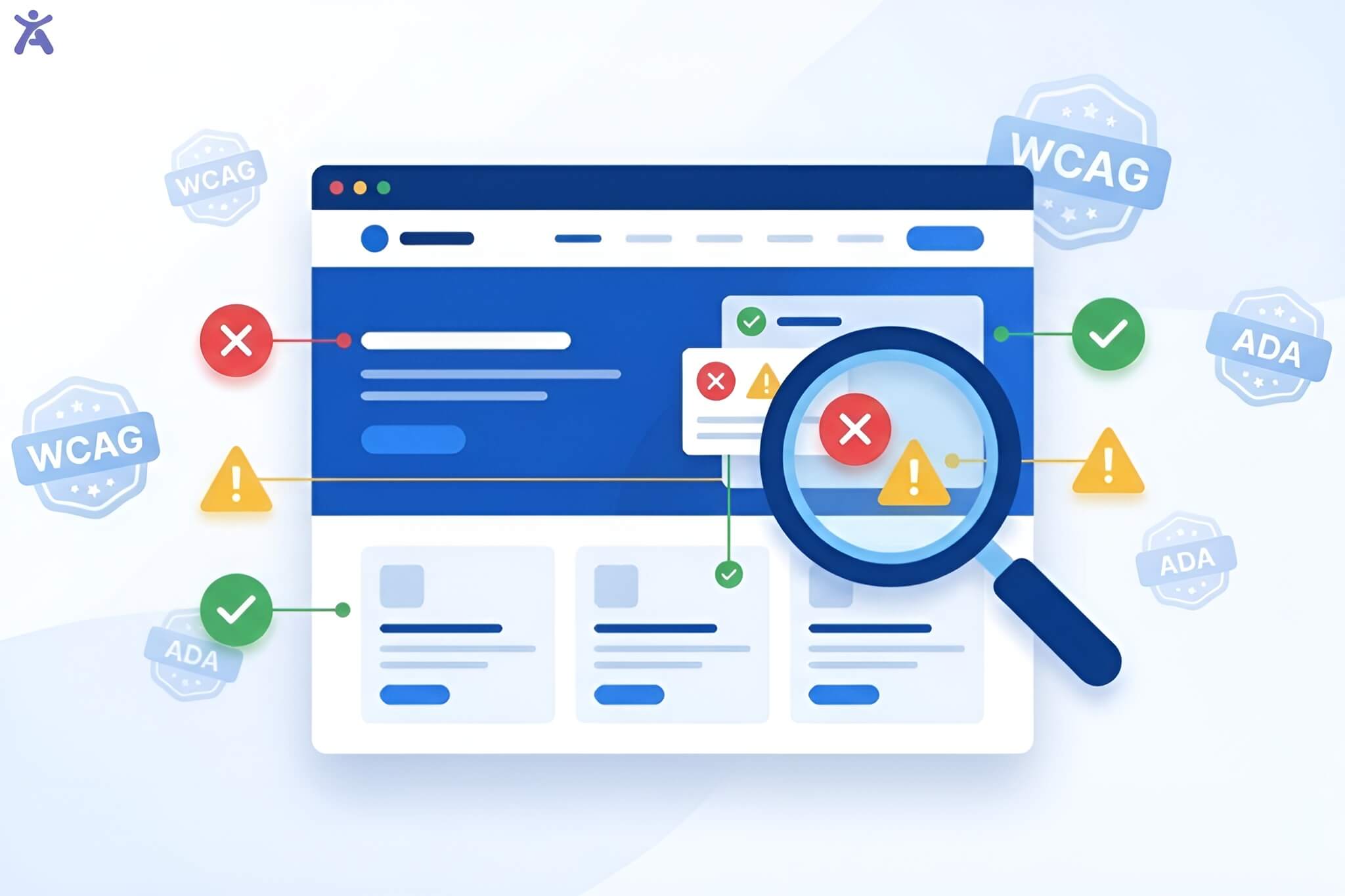

Have you thought about how a screen reader user explores your homepage? Web accessibility best practices are steps to help everyone use digital content easily. This includes people with different abilities and disabilities. Using standards like WCAG (Web Content Accessibility Guidelines) helps create an inclusive space. This way, all users can see, understand, navigate, and interact with your website easily.
In today’s digital world, accessibility isn’t just a legal requirement. It’s essential for good user experience (UX) design. Or how someone with color blindness sees your call-to-action buttons? Focusing on accessibility helps everyone, not just those with disabilities. It creates a cleaner, more intuitive, and stronger experience for all visitors.
Quick Summary
web accessibility best practices aren’t just about compliance; it’s a powerful driver for better UX and business growth. This guide shares key strategies to make your site inclusive. It includes semantic HTML, color contrast, and keyboard navigation. Implementing accessibility standards improves usability for everyone and boosts SEO. Start auditing your site today to unlock a wider audience and enhance brand loyalty.
Why Accessibility Boosts UX and Business Value
Making accessibility part of your design strategy does more than prevent lawsuits. It also enhances the quality of your digital presence. When you design for the margins, you inevitably create a better product for the center.
Meeting WCAG Standards and Regulatory Requirements

Following the Americans with Disabilities Act (ADA) and the European Accessibility Act is key to avoiding legal issues. However, the true benefit comes from the framework these laws create. The Web Content Accessibility Guidelines (WCAG) guide you in making better digital experiences. Meeting these standards helps your site work well on different browsers and devices. This reduces bugs and lowers maintenance costs over time.
Expanding Your Market Reach
According to the World Health Organization, over 1 billion people live with some form of disability. By ignoring web accessibility best practices, you are effectively closing your digital doors to a massive segment of the population. Inclusive design lets your business connect with more customers. This includes older adults who may have vision or mobility challenges. It’s a simple equation: more accessible sites equal more potential customers.
Enhancing User Satisfaction and Brand Loyalty
Users remember how a website makes them feel. If your site is frustrating to navigate via keyboard or impossible to read due to poor contrast ratios, users will leave. Conversely, an accessible site feels frictionless. When users with disabilities encounter a brand that values their experience, it builds deep trust and brand loyalty. This positive feeling spreads. It boosts your reputation as a socially responsible and user-focused organization in the USA and beyond.
Boosting SEO Performance and Search Engine Rankings
There is a significant overlap between accessibility best practices and SEO performance. Search engines like Google work like screen readers. They depend on semantic structure, alt text, and text-based content to understand your pages.
- Alt text helps image indexing.
- Heading structure clarifies content hierarchy.
- Transcripts for audio make multimedia searchable. Improving accessibility boosts your site’s search engine rankings. This change drives more organic traffic to your business.
Web accessibility best practices for a Robust UX
Building an accessible website starts with the basics of design and code structure. These key elements help users see and understand your content easily.
Visual Design for Clarity and Comfort
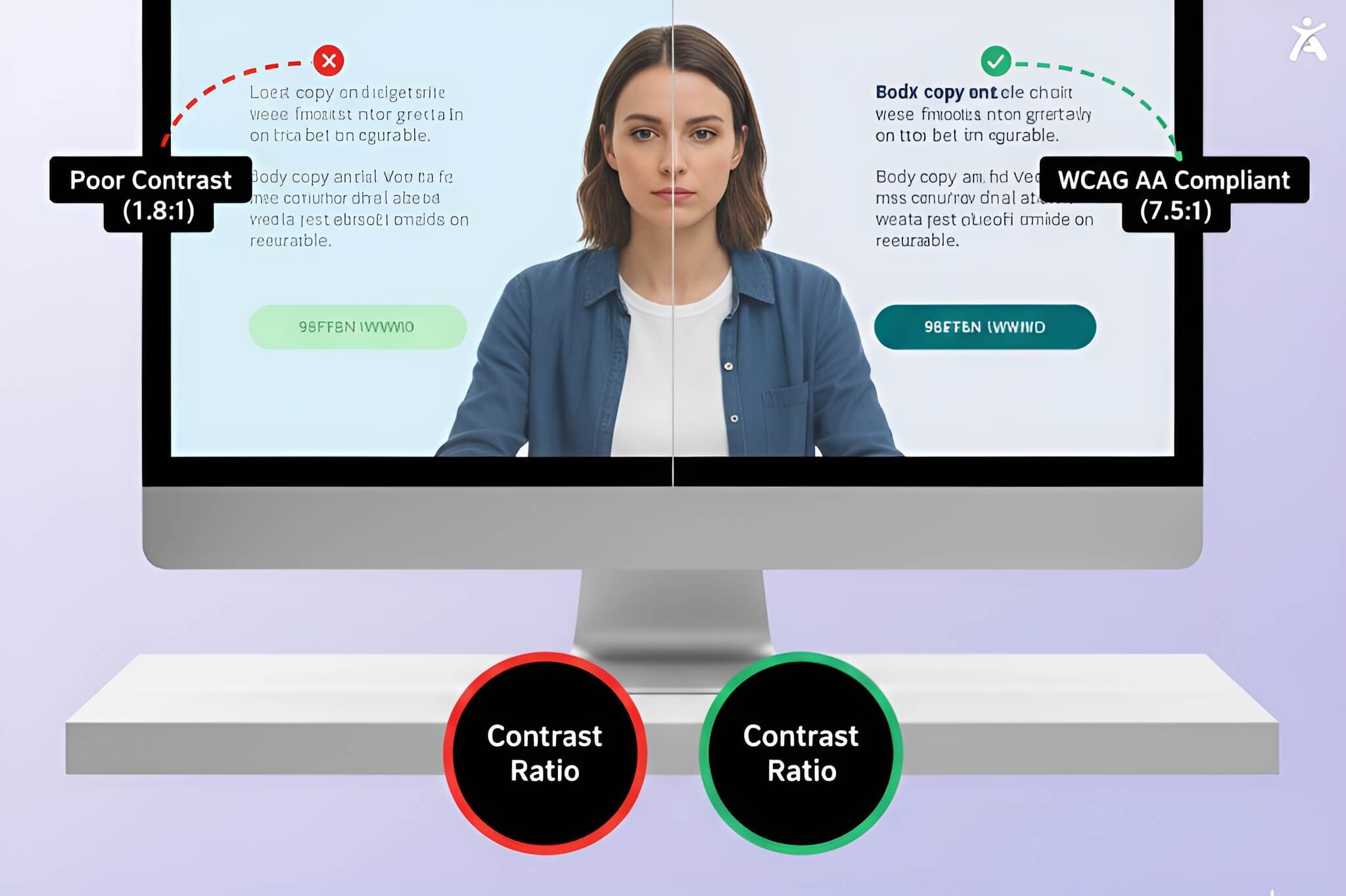
Visual accessibility is about more than just aesthetics; it’s about readability.
- Color Contrast: Ensure a high contrast ratio between text and background. Tools like the Accessify WebAIM contrast checker can help you meet the minimum 4.5:1 ratio required for normal text.
- Color Independence: Never use color alone to convey information. Use icons or text labels with color-coded error messages. This helps users with color blindness understand the feedback.
- Typography: Choose readable fonts and allow for text resizing without breaking the layout.
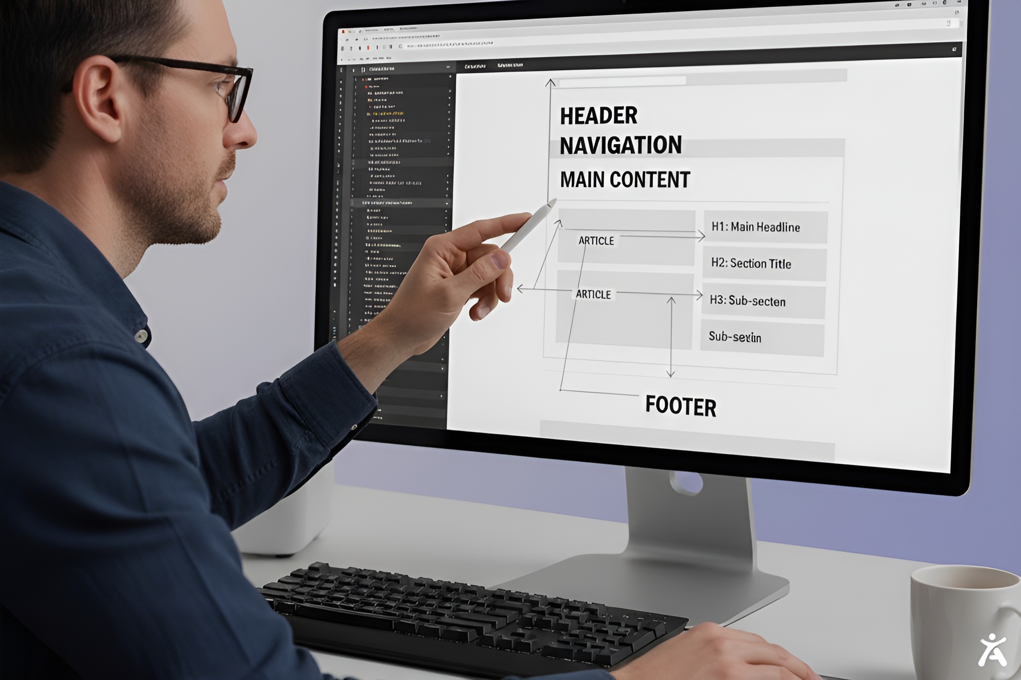
Content Structure for Scan ability and Comprehension
A well-structured page is easier for everyone to read. This helps those using assistive technologies and those who are just scanning quickly.
- Semantic HTML: Use proper HTML tags (<header>, <nav>, <main>, <article>) to define the regions of your page. This allows screen readers to jump to relevant sections.
- Heading Hierarchy: Nest headings logically (H1, followed by H2, then H3). Do not skip levels. This gives a clear outline. It helps users see how different sections relate to each other.
- Plain Language: distinct from code, the content itself should be simple. Avoid jargon and overly complex sentences to assist users with cognitive impairments.
Intuitive Navigation and Interaction
Navigation should be consistent and predictable.
- Keyboard Navigation: Make sure you can reach all interactive elements, like links, buttons, and forms, using the Tab key. Users should be able to navigate through the site without a mouse.
- Focus Indicators: Never remove the default focus outline in your CSS unless you replace it with a highly visible alternative. Sighted keyboard users rely on this to know where they are on the page.
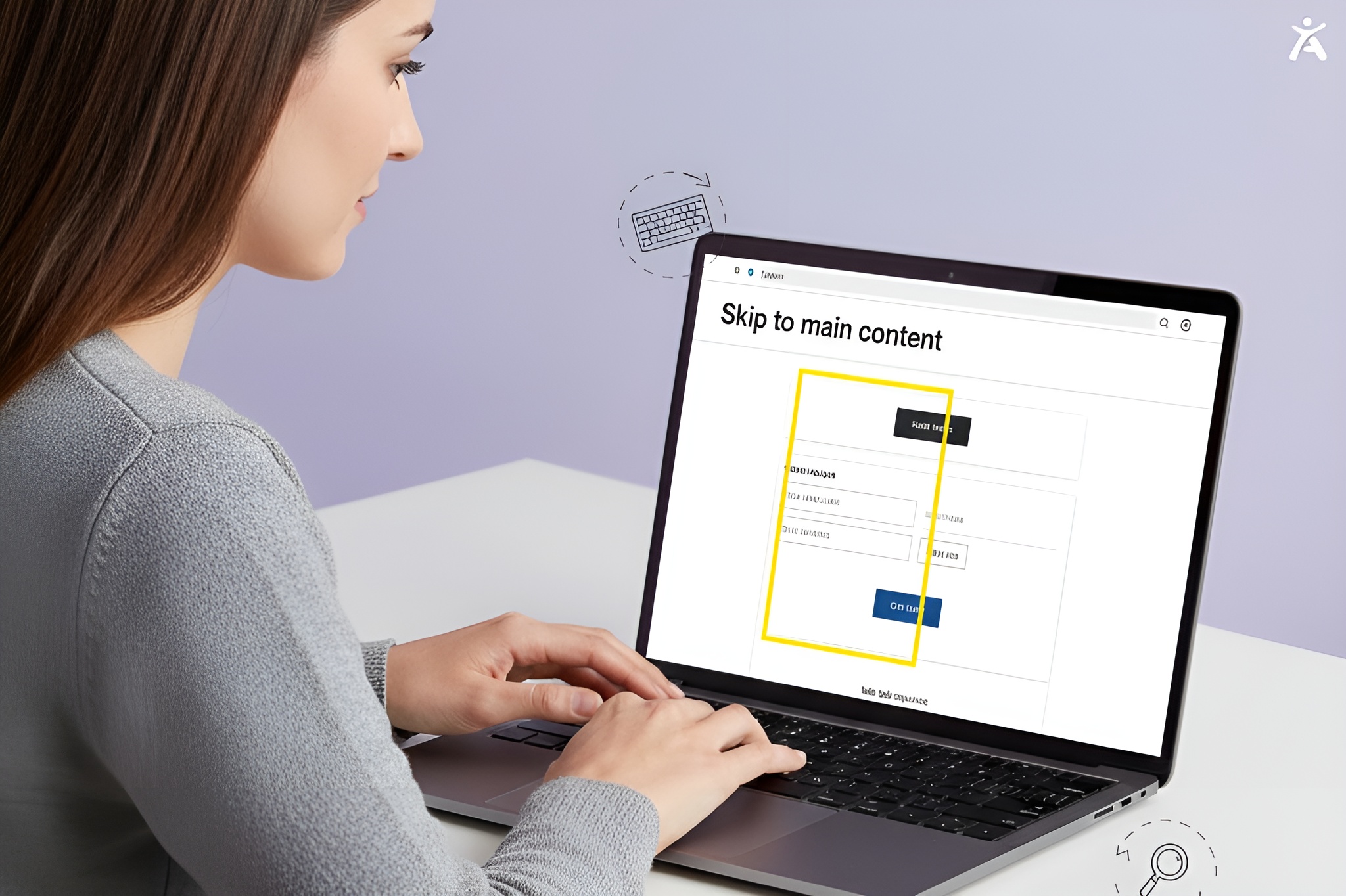
- Skip Links: Add a “Skip to Main Content” link at the top of the page. This allows keyboard and screen reader users to bypass repetitive navigation menus and get straight to the content.
Designing Accessible Interactive Experiences
Interactive elements are often where accessibility barriers are most common. From forms to dynamic modals, these components require careful attention to ensure they are usable by everyone.
How Can Forms Be Made More Accessible?
Forms are critical for conversion, yet often frustrating for users with disabilities.
- Labels: Every form field must have a visible <label> explicitly associated with it. Placeholder text is not a substitute for a label, as it often disappears when typing and usually has poor contrast.
- Error Identification: Error messages should be clear, easy to locate, and provide instructions on how to fix the issue.
- Time Limits: If a form has a time limit, provide a way for users to extend it so they don’t lose their data.
What Considerations Are Needed for Dynamic Content?
Modern websites often update content without reloading the page.
- ARIA Live Regions: Use ARIA live regions to announce changes for screen readers. This keeps the user’s focus in place. For example, when a new email loads in an inbox or a search result update.
- Status Messages: Make sure status messages, like “Form submitted successfully,” can be detected by programs. This helps assistive tech notify users.
How do assistive technologies interact with UX?
Understanding how tools like screen readers, braille displays, and switch devices work is key to good design.
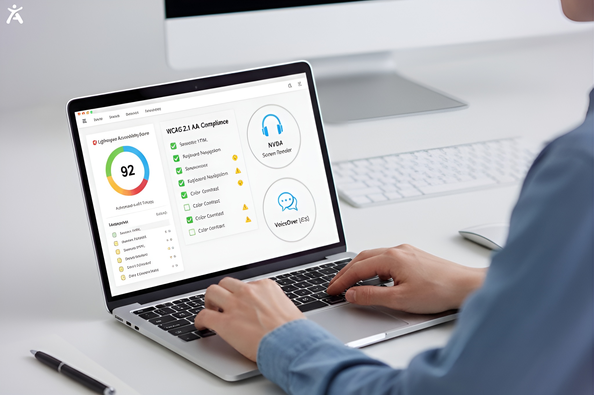
- Testing: Don’t just rely on automated checkers. Test your site using a screen reader like VoiceOver or Accessify.app.
- Compatibility: Avoid custom widgets that override standard browser behaviors unless absolutely necessary. Standard HTML elements have built-in accessibility features. Custom
buttons usually don’t offer these.
Integrating Accessibility into Your Workflow
Accessibility shouldn’t be a retrofit or a final step before launch. It needs to be baked into your process from the very beginning to be effective and cost-efficient.
Proactive Design and Development Considerations
Shift accessibility “left” in your timeline.
- Design Phase: Designers must add accessibility notes to wireframes. This includes details like reading order and heading levels.
- Development: Developers should use semantic HTML and ARIA roles where appropriate during the build, rather than fixing code later.
- Checklists: Use an accessibility checklist based on WCAG standards during every sprint review.
Testing and Quality Assurance for Continuous Improvement
Quality assurance (QA) for accessibility is an ongoing process.
- Automated Testing: Use tools like Accessify or axe-core to catch programmatic errors (e.g., missing alt text).
- Manual Audits: Have human testers review keyboard navigation and complex interaction flows.
- User Testing: Ideally, include people with disabilities in your user testing groups to get genuine feedback on the user experience.
Ongoing Maintenance and Support
The web is not static. As you add new content and features, you must maintain accessibility standards.
- Training: regularly train content editors on how to add accessible content, such as proper alt text for images and hierarchy for headings.
- Feedback Loops: Provide an accessibility statement with a way for users to report barriers they encounter. This feedback is invaluable for quick fixes and long-term improvements.
Pro Tips for UX Accessibility
- Don’t rely on overlays: Avoid “quick fix” accessibility overlays or widgets. They often interfere with screen readers and don’t solve the underlying code issues.
- Caption everything: Captions benefit everyone, not just the Deaf community. Many users watch videos silently in public spaces.
- Zoom matters: Ensure your site layout doesn’t break when zoomed in up to 200%.
Embrace Inclusive Design
Web accessibility is a journey, not a destination. By following these best practices, you’re not just meeting the law. You’re also creating a better, more human-centered digital experience. Start small if you need to. Fix your contrast. Add alt text. Check your keyboard navigation. Just start today. Ready to transform your user experience? Audit your website now and open your digital doors to everyone.
FAQs
The most important rule is to ensure your site is perceivable, operable, understandable, and robust (POUR). This usually begins with semantic HTML and keyboard accessibility. This way, users can navigate and understand content without a mouse.
Yes, web accessibility best practices significantly boost SEO. Search engines like sites with clear headings, descriptive alt text, and transcripts. These features help make content easier to crawl and index.
You can start with automated tools like WAVE, Accessify or Google Lighthouse. A full audit needs manual testing. This involves using keyboard-only navigation. It also includes testing with screen readers, such as NVDA or VoiceOver.
Good color contrast ensures that text is readable for users with low vision or color blindness. It also improves readability for all users in low-light conditions or on screens with glare.
No, web accessibility best practices improve the user experience for everyone. It helps people with temporary disabilities, such as a broken arm. It also aids those facing situational limits, like bright sunlight, and those with slow internet connections.