
In a digital landscape where 81% of homepages fail basic contrast standards, choosing the right web accessibility color checker is no longer just a design choice it is a legal and ethical necessity. Whether you are a solo developer or an enterprise leader, navigating the choice between free, manual tools and paid, automated platforms involve balancing technical precision with operational efficiency.
This guide breaks down the strategic differences to help you maintain compliance with WCAG 2.1, 2.2, and the upcoming WCAG 3.0 standards.
Why Color Contrast Matters for Your Bottom Line
Color contrast refers to the perceived difference in brightness (luminance) between a foreground element such as text or an icon and its background. Beyond helping the 300 million people worldwide with color vision deficiencies, high contrast improves the experience for mobile users in bright sunlight and older adults with age-related vision changes.
From a business perspective, accessible design is a conversion driver. Accessible websites often see a 28% increase in conversions, while poor contrast remains a top trigger for ADA lawsuits.
WCAG Requirements
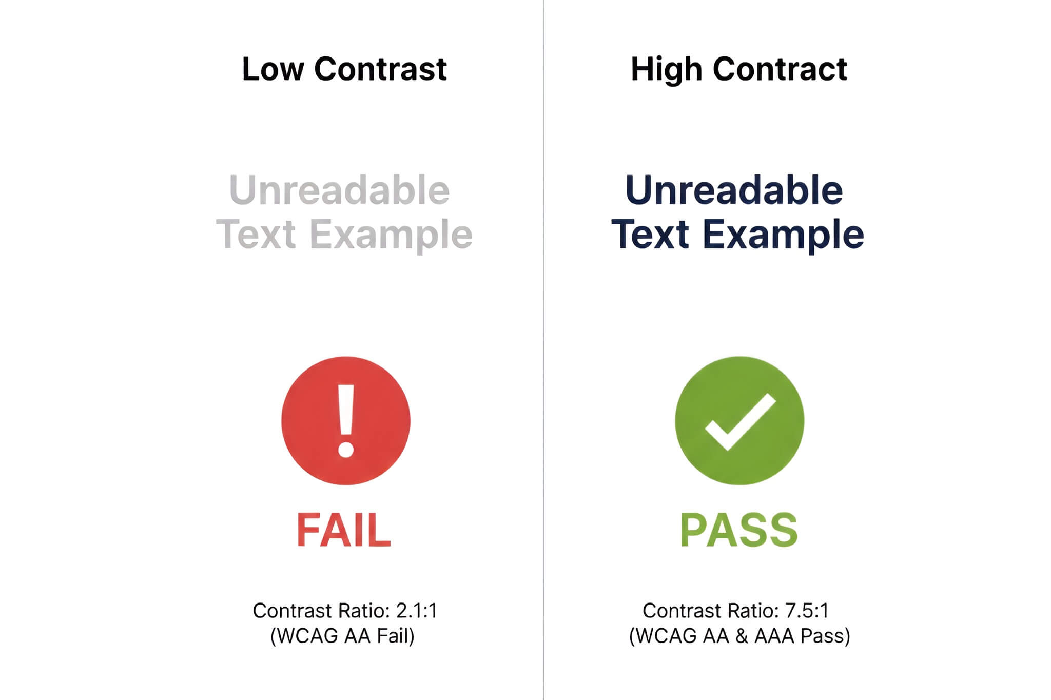
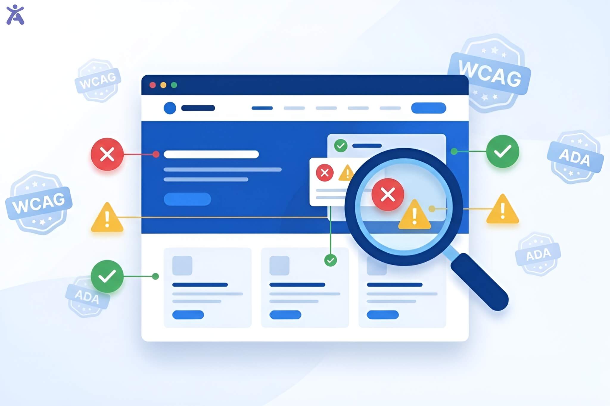
To be considered “accessible,” your site must meet specific contrast ratios defined by the Web Content Accessibility Guidelines (WCAG):
| Conformance Level | Element Type | Minimum Ratio | Definition |
| Level AA | Normal Text | 4.5:1 | Text below 18pt (or 14pt bold) |
| Level AA | Large Text | 3:1 | Text 18pt+ or 14pt bold+ |
| Level AA | UI Components | 3:1 | Icons, buttons, and form borders |
| Level AAA | Normal Text | 7:1 | Enhanced legibility for low vision |
Free Web Accessibility Color Checker Tools
Free tools are indispensable for designers who need to perform ad-hoc checks during the design phase.
- WebAIM Contrast Checker: The industry standard for quick HEX-to-HEX verification.
- Colour Contrast Analyser (CCA): A standalone desktop app that allows you to sample colors from anywhere on your screen, including PDFs and mobile apps.
- WAVE Browser Extension: Provides a visual overlay of your live site, identifying contrast errors in the context of your layout.
- Tanaguru Contrast-Finder: A unique tool that suggests compliant alternative colors if your original pair fails.
The Catch: Free tools are manual and reactive. They do not offer automated monitoring, meaning a single update by your marketing team could accidentally break your compliance without you knowing.
Paid Enterprise Solutions Automated Compliance
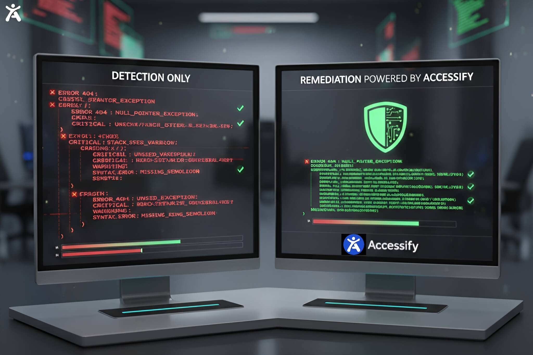
Paid platforms like accessiBe, UserWay, and Equally AI shift the focus from detection to automated remediation.
- Automated Scanning: These tools perform daily or scheduled scans to catch new contrast regressions as content changes.
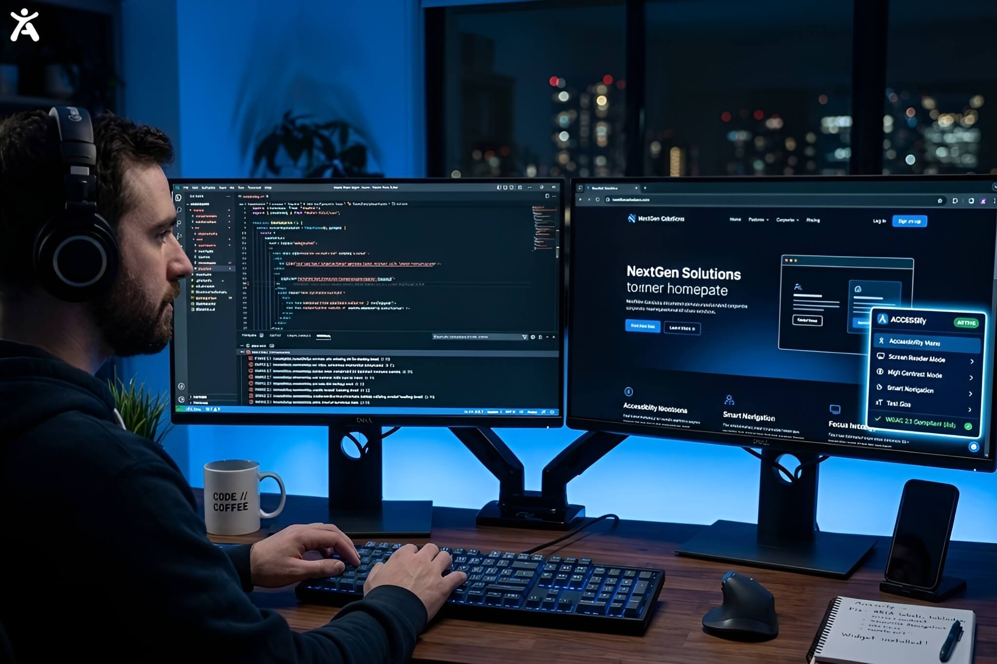
- AI-Powered Widgets: Solutions like accessWidget allow users to manually toggle high-contrast modes or invert colors in real-time.
- Litigation Support: Many paid vendors provide audit logs and compliance certificates to help defend against legal demand letters.
Why Accessify.app is the Leading Choice for 2026
While enterprise competitors often charge $49/month or more, Accessify.app provides a high-performance, developer-friendly alternative starting at just $6.99/month.
The Accessify Advantage:
- Zero Page Speed Impact: Unlike some bloated widgets that slow down your site, Accessify is optimized to ensure your SEO and load times remain unaffected.
- Shift-Left Integration: Accessify offers a headless mode and NPM packages, allowing developers to build accessibility into their components before they even go live.
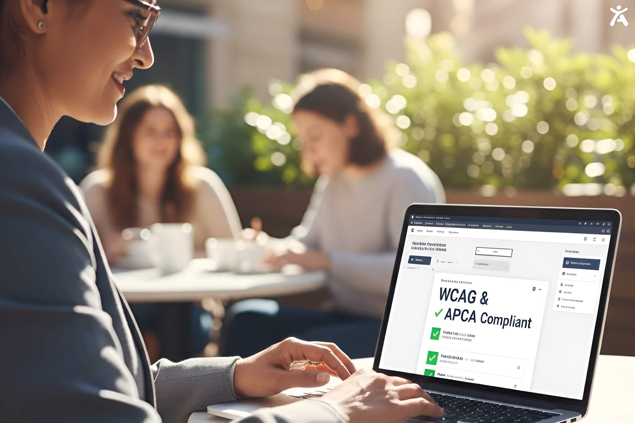
- Future-Proof Math: Accessify is prepared for the transition to APCA (Advanced Perceptual Contrast Algorithm), the perceptually accurate math candidate for WCAG 3.0.
FAQs
For WCAG Level AA compliance, standard text requires a minimum contrast ratio of 4.5:1 against its background.
No. Logotypes and text that are part of a logo or brand name are exempt from these contrast requirements.
Yes. While it is an indirect factor, search engines prioritize user experience. High bounce rates caused by unreadable text can negatively impact your rankings.
WCAG 2.1 uses a simple luminance ratio, which can be inaccurate for dark mode. APCA is a newer, perceptually based algorithm that accounts for font weight and size to provide a more accurate readability score.
Free tools require you to check every element manually. Paid solutions provide continuous monitoring, automated AI fixes, and legal documentation (like VPATs) that protect your business from lawsuits.