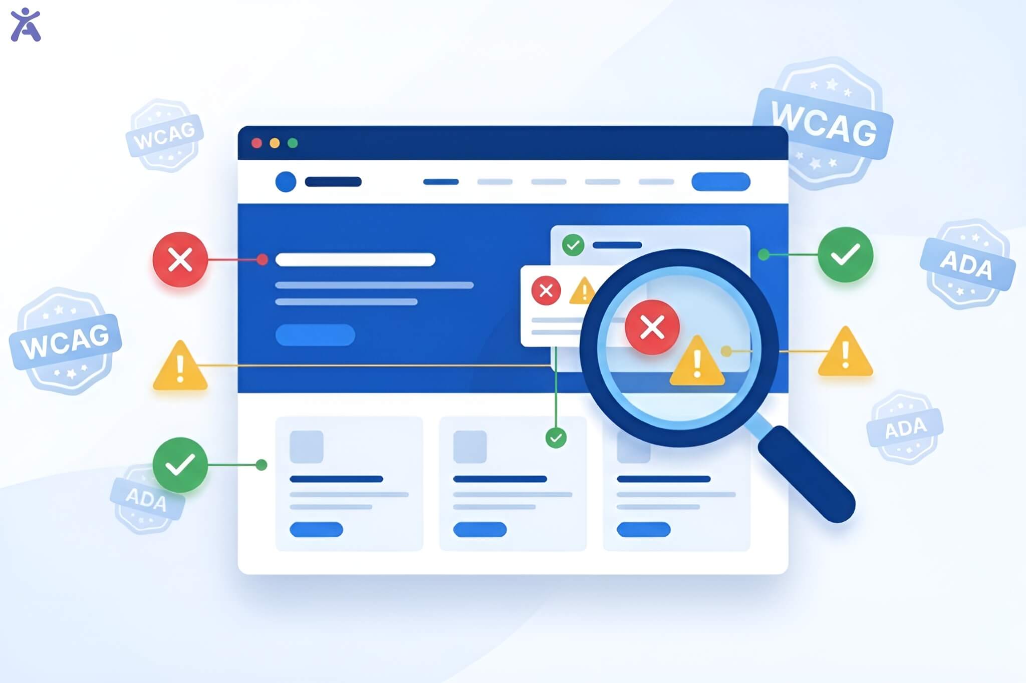

Visual clarity isn’t just optional for your website; it’s essential for inclusive design. A good web accessibility contrast checker helps your text stand out. It makes sure the text is clear against its background. This makes it easier for users with visual impairments to read your content. It also meets global standards.
Not meeting these standards can turn away millions of users and put your business at legal risk. But how do you choose the right tool to fix these issues before they become problems? In this guide, we explore the best tools and expert tips. You’ll learn how to master color contrast and enhance your site’s user experience.
Quick Summary
Improving color contrast on your website isn’t just for looks. It’s also about making it accessible and inclusive. Analyzing and improving your site’s contrast can make your content easier to see and use. This is especially important for people with visual impairments. These tools help identify contrast issues in your design. They also suggest solutions to meet standards like WCAG (Web Content Accessibility Guidelines). Focusing on contrast improves user experience. It also shows your commitment to creating an accessible web for everyone.
The Power of Perceivable Contrast
Enhancing User Experience for Everyone
Color contrast is often discussed in the context of compliance, but it is actually a cornerstone of good user experience (UX). High contrast improves readability for everyone, not just those with low vision. Think about reading a screen in bright sunlight or on a mobile device with the brightness turned down. High-contrast text ensures that your message is legible in less-than-ideal environments. Make sure your foreground and background colors stand out. This helps everyone have a smoother and more enjoyable browsing experience.
A Brief Look at Web Accessibility and WCAG
Web accessibility is built on the principle that the internet should be open to everyone, regardless of ability. The Web Content Accessibility Guidelines (WCAG) serve as the global playbook for making this happen. These guidelines are organized into four principles: Perceivable, Operable, Understandable, and Robust (POUR). Color contrast falls squarely under “Perceivable.” It makes sure users can see information and interface elements. This sets a standard for digital inclusion that all modern websites should meet.
Understanding WCAG and Color Contrast Ratios
What Is Color Contrast?
Why It Matters
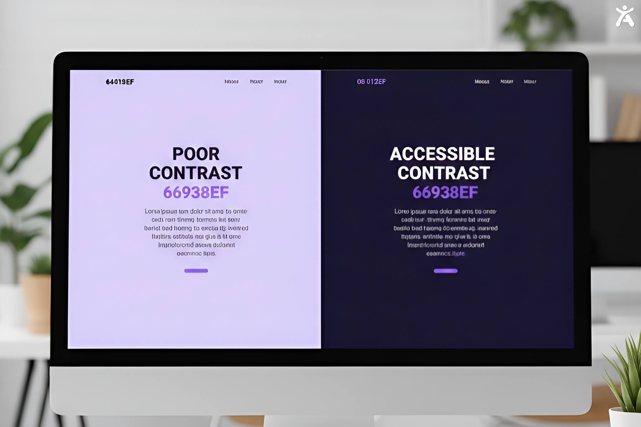
At its core, color contrast refers to the difference in light between the foreground (usually text) and the background. It is measured as a ratio ranging from 1:1 (white text on a white background) to 21:1 (black text on a white background). A low ratio makes text hard to see. It blends into the background, causing eye strain. This is especially tough for people with color vision deficiencies or low vision. A web accessibility contrast checker calculates the ratio for you. This takes the guesswork out of your design choices.
WCAG Standards
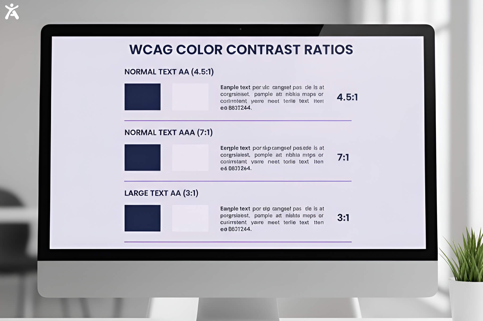
The WCAG defines two main levels of contrast conformance: AA and AAA.
- Level AA (Minimum): Requires a contrast ratio of at least 4.5:1 for normal text and 3:1 for large text. This is the standard most businesses legally need to meet
- Level AAA (Enhanced): Requires a stricter ratio of 7:1 for normal text and 4.5:1 for large text. While not always mandatory, hitting AAA is the gold standard for accessibility.
Applying Standards
Not all elements on your page need to meet the same strict standards.
- Body Text: Must meet the 4.5:1 ratio (AA)
- Large Text: Defined as 18pt (or 14pt bold), this requires a lower ratio of 3:1
- User Interface Components: Buttons and input fields must have a contrast ratio of 3:1 with their surrounding colors. This helps users see the boundaries clearly.
- Decorative Images: Logos and decorative elements usually don’t need to meet contrast rules. Still, it’s best to ensure clarity.
Essential Color Contrast Checker Tools
Browser-Based & Web Tools
For most developers and designers, browser-based tools are the first line of defense. The WebAIM Contrast Checker is arguably the most popular, offering a simple interface where you input hex codes to get an immediate pass/fail rating. Another excellent option is the Tanaguru Contrast-Finder, which not only checks your colors but suggests valid alternatives if your original choices fail. These tools are perfect for quick validation during the early stages of development.
Desktop Applications
When you need to test outside the browser in a mockup or a PDF, desktop applications are invaluable. The Color Contrast Analyzer (CCA) by TPGi is a staple in the industry. It features an eyedropper tool that allows you to pick colors from anywhere on your screen, not just web pages. This makes it a favorite for designers working in Adobe Creative Cloud or Figma who want to verify contrast before a single line of code is written.
Browser Extensions & Plugins
Integrating checks into your workflow saves time. Tools like the Accessify and Accessibility Insights for Web are browser extensions. They show contrast errors right on your live site. They highlight specific elements with low contrast, so you can see exactly what users see. This real-time feedback loop is critical for QA testers and developers looking to catch issues during the build phase rather than after launch.
Mobile-Specific Tools
With mobile traffic dominating the web, testing on handheld devices is non-negotiable. Apps like the Accessify for Android let you take a snapshot of an app’s screen and receive suggestions for contrast improvements. For iOS, you can use built-in accessibility inspectors in Xcode or third-party apps that simulate various color blindness conditions. Ensuring your mobile app meets contrast standards is vital for users in varied lighting conditions.
Key Features
Not all checkers are created equal. When selecting a web accessibility contrast checker, look for these features:
- Eyedropper Tool: For selecting colors without knowing the hex code
- Suggestion Engine: To propose compliant alternatives when your colors fail
- WCAG Support: Explicit toggles for AA and AAA standards
- Simulation Modes: Ability to preview how colors look to users with color blindness (Protanopia, Deuteranopia, etc.).
Mastering Color Contrast Design Tips

Proactive Design
Accessibility should start before the first pixel is placed. When building a brand’s color palette, define a set of core colors that inherently have high contrast. Tools like Color Safe allow you to generate accessible text colors based on your chosen background. By establishing a “safe” palette early, you prevent the headache of retrofitting accessibility later.
Typography’s Role
Contrast isn’t just about color; it’s about visual weight. A thin, light-gray font on a white background is a readability nightmare. Increasing the font weight or size can help meet compliance. Large text can have a lower contrast ratio threshold of 3:1. However, relying solely on size is risky; pairing bold typography with strong color contrast is the safest bet for readability.
Beyond Text
Charts, graphs, and infographics often get overlooked in accessibility audits. Use color to tell slices apart in a pie chart. Make sure the colors contrast well. You can also add white borders for better separation. Icons that serve a function (like a magnifying glass for search) also need to meet the 3:1 contrast ratio against the background to be perceivable.
Interactive States
Your buttons might look great in their resting state, but what happens when a user hovers over them or navigates via keyboard? Interactive states often shift colors to indicate activity. Ensure that these state changes also maintain compliant contrast ratios. A common mistake is a button turning light gray on hover, making the white text inside it unreadable.
Complex Backgrounds
Placing text over images or gradients is a common design trend that poses significant accessibility challenges. Since the background color varies, a single text color might not pass contrast checks across the entire area. To fix this, use a semi-transparent overlay (like a dark scrim) behind the text to ensure consistent contrast, or add a heavy drop shadow to separate the text from the busy background.
User-Controlled Contrast
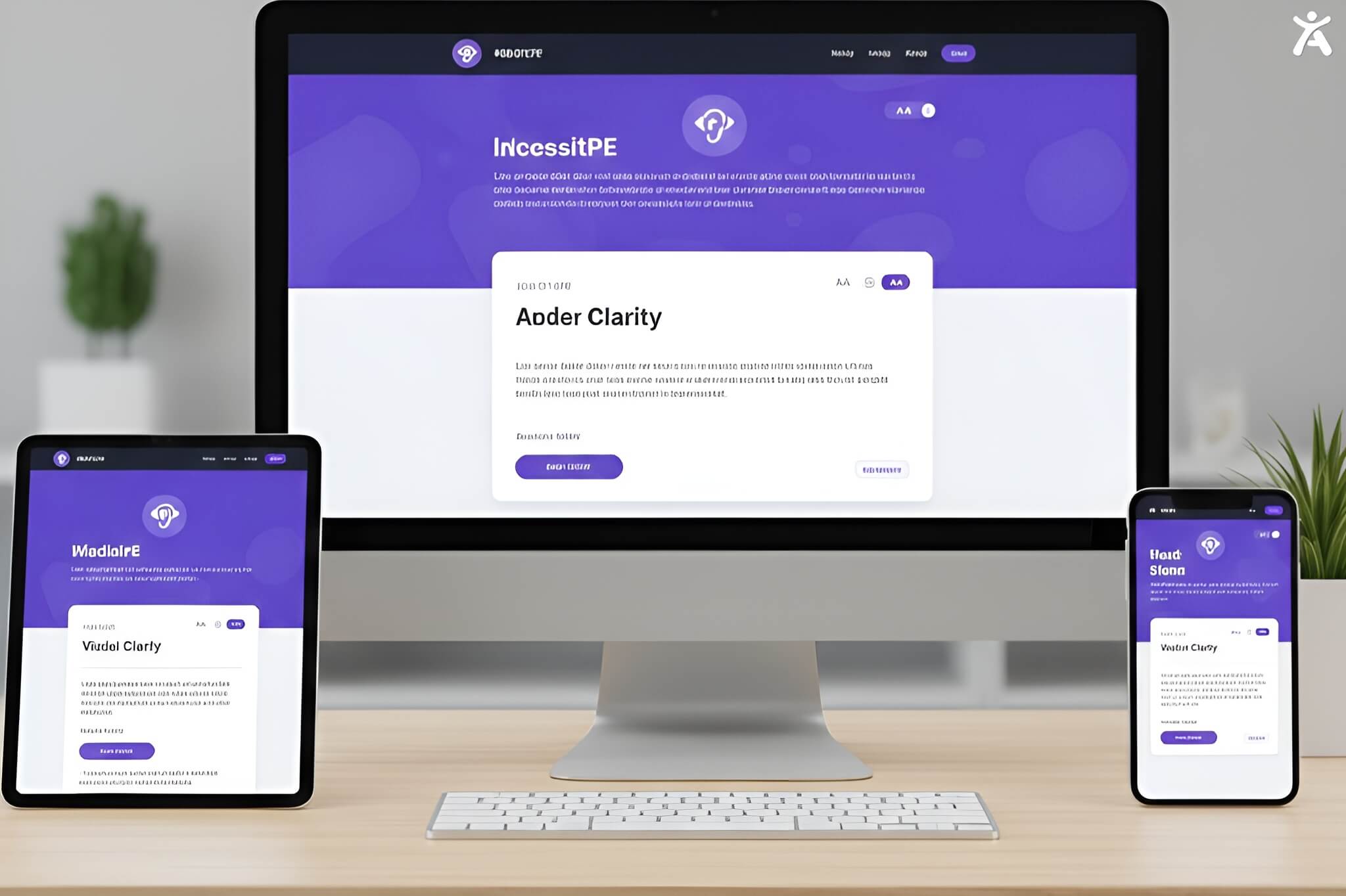
Sometimes, the best solution is to let the user decide. Many modern sites offer a “High Contrast Mode” toggle, separate from the system settings. This empowers users with visual impairments to switch to a theme often black text on a yellow background or white on black that is specifically optimized for maximum readability.
Troubleshooting Common Contrast Issues
Mistake 1
Over-Reliance on Color Alone
Never use color as the only visual cue for conveying information. For example, if an error message is just red text, a color-blind user might not distinguish it from normal text. Always pair color with text labels (like “Error:”) or icons (like a warning triangle) to ensure the message is conveyed regardless of color perception.
Mistake 2
Ignoring Alpha Transparency
When you use opacity (alpha values) on text or backgrounds, the perceived color changes based on what is underneath. A grey text #808080 might pass on white, but at 50% opacity, it effectively becomes #C0C0C0 and fails. Always test the “flattened” or final rendered color, not just the base hex code.
Mistake 3
Overlooking User-Generated Content
If your platform allows users to customize their profile colors or upload cover images, you risk accessibility violations. Implement dynamic checks that automatically adjust text color (switching from white to black) based on the luminosity of the user’s uploaded background.
Mistake 4
Disregarding Environmental Factors
Contrast checkers verify technical compliance, but they don’t simulate glare on a laptop screen outdoors. While you can’t control the sun, you can control your design. Avoid subtle contrasts (like light grey on white) for essential content, as these are the first to disappear in bright lighting.
Mistake 5
Neglecting Placeholder Text
Placeholder text in form fields is notoriously difficult to read because designers often make it light grey to indicate it’s temporary. However, if it’s too light, users might not see the hint at all. Ensure placeholders meet the 4.5:1 ratio, or better yet, use floating labels that remain visible while typing.
Integrating Contrast into Workflows

Early Stages
Start your projects by auditing your brand colors. If the official brand blue is too light for white text, create a “digital-only” variation that is slightly darker to meet WCAG standards while maintaining the brand spirit.
Design Software Integration
Don’t wait for development to check contrast. Use plugins like Stark or A11y directly within Figma, Sketch, or Adobe XD. These allow designers to check contrast ratios on the fly, ensuring that the handoff to developers includes accessible specs.
Development Processes
Incorporate automated accessibility testing into your CI/CD pipeline. Tools like axe-core can automatically scan your code for low-contrast elements every time you commit updates, catching regressions before they reach production.
Regular Audits
Websites change. New content is added, and layouts shift. Schedule quarterly accessibility audits to manually review key pages with a web accessibility contrast checker. This ensures that new landing pages or marketing banners haven’t inadvertently broken your contrast compliance.
Expert Advice
Use the “Squint Test”: If you squint at your screen and the text disappears or blurs into the background, the contrast is likely too low, regardless of the numbers.
Don’t Chase 21:1: While high contrast is good, pure black (#000000) on pure white (#FFFFFF) can actually cause eye strain for some users (dyslexia, Irlen syndrome). A very dark grey (e.g., #1A1A1A) on an off-white background is often more comfortable to read.
Making Digital Experiences Accessible for All
Recap of Key Takeaways
Using a web accessibility contrast checker isn’t just about ticking a compliance box; it’s about empathy and usability. By selecting the right tools, whether browser extensions for quick fixes or desktop apps for deep analysis you ensure your digital presence is welcoming to everyone. Remember to aim for a 4.5:1 ratio for standard text and integrate checks early in your design process.
Commitment to Inclusive Design
Accessibility is a journey, not a destination. As you refine your site, keep testing, keep learning, and keep prioritizing the user. Ready to ensure your site is compliant? Start auditing your color palette today and build a web that works for everyone.
FAQs
AA is the standard benchmark for most legal regulations (such as the ADA in the US or the AODA in Canada). It ensures content is accessible to most people. AAA is a stricter standard reserved for specialized applications, like government sites for the disability community.
Yes, but not for text. You can use low-contrast brand colors for decorative elements, borders, or backgrounds, provided they don’t contain essential information. For text, you must use a variant that meets the ratio.
No. Logos and brand names are explicitly exempt from the minimum contrast requirements. However, ensuring your logo is visible is simply good branding.
Technically, “inactive” user interface components are exempt from WCAG contrast requirements. However, from a UX perspective, it’s best if they are still visible enough to be recognized as buttons, even if they look “disabled.”
Most standard checkers fail with gradients because they only accept a single hex code. You need to test the lightest and darkest parts of the gradient behind the text. If the text fails against any part of the gradient it sits on, it’s not compliant.